After a fairly unsatisfactory foray into using an A4 sketchbook I 'm going back to an A3 size where I've realised I'm far more comfortable. I bought several from Two Rivers at Frogmore when I was at Patchings Art Festival and this is my last one.
The topic "Man made environment" has made me think about what is natural and what is man made. It seems to me that all things have a natural origin and man modifies in very many ways.
"Man made" has connotations of something inferior or synthetic but in fact it is a sign of development, initiative and the creative use of natural resources. The wonderful bridge at Ironbridge or the inlay work which is such a feature of the Taj Mahal are man made from naturally occurring materials and very beautiful.
 |
| Ironbridge |
 |
| Marble inlaid with slices of semi precious stones |
In the summer I visited Masson Mill in Matlock and I found a strange sort of beauty of the industrial kind.
 |
| Masson Mill |
I'm going to focus on lines and grids and to do sketches that may eventually find their way into my screen printing work.
This image is taken at the Yorkshire Sculpture Park.

The tantalising glimpse through the window is almost obscured by the grid of the window with its heavy surrounding frame. I used Paint.net to manipulate the image.
 |
| The Dents effect at the default setting |
 |
| I isolated a scary Halloween image |
 |
I flooded the window frame with green and the smaller panes picked it up as well. (I find Paint.net a bit unpredictable). I put in touches of blue and suddenly the whole thing looks 3D. It is a much gentler image than the original because of the pastel colour.

This one took the same starting point but coloured the inside of the panes rather than the frame. I used several blue tones. What appears to be yellow is a tiny bit of the original background showing through. The colours are flat but the many lines make it interesting and textural. It is more robust than the one above and far more exciting.
 |
| I isolated one pane |
I took the idea of the grid and did a print on paper from a piece of glass.

I put some yellow acrylic paint onto glass and daubed on some green. I put yellow paper over it and used a 4cm roller to make grid type marks. The result was not impressive - far too much yellow and not enough blue.

The second print was on blue paper and looks much better - it gave the same feeling of an ethereal vista as my photo. The grid lines from the roller are double and sometimes triple as I've repeated the rolling.


The idea of lines and what to do with them appeals to me so I thought I'd cut myself some bits of card and just play awhile.
I dipped the card into paint and as I finished with a colour I snipped off the end.
There are some interesting shapes emerging from the intersections.

I drew the above image and made a repeat pattern out of it. It forms stripes in two directions.

The colour combination here is really subdued and I find it quite uninteresting. The mixing of complementary and harmonious colours is something I need to look at further. There is more interest if I zoom in.

The pattern of the corrugated card shows up well and adds to the texture of the image.
This is very busy with lots of texture. I think it looks like ripples on sand.

These are just the colours I had left on my palate. I dipped the card in and did a twisted line print then kept repeating without snipping my card. This gives a very varied array of colours that is surprisingly attractive in its combinations.
 |
| A bit of corrugated card 10 x 6 cm |
I dipped the card into paint and as I finished with a colour I snipped off the end.
 |
| Red in a regular grid and orange in a staggered grid at 45 degrees |
There are some interesting shapes emerging from the intersections.

I drew the above image and made a repeat pattern out of it. It forms stripes in two directions.

 |
| More muted colours |
The colour combination here is really subdued and I find it quite uninteresting. The mixing of complementary and harmonious colours is something I need to look at further. There is more interest if I zoom in.

The pattern of the corrugated card shows up well and adds to the texture of the image.
 |
| Quick, close together print that looks like ripples on sand. |
This is very busy with lots of texture. I think it looks like ripples on sand.


I looked online at "lines" and was amazed to find how many ways they could be presented.
 |
| httpwww.graphicxtras.comphotoshop-patternsgrid-gallery-patterns-112.png |
These are some of my favourites :
 |
| httpwww.graphicxtras.comphotoshop-patternsgrid-patterns-photoshop.htm |
 |
| httpwww.graphicxtras.comphotoshop-patternsgrid-patterns-photoshop.htmmm |
These seem much less complicated, they are easily understood. It reminds me of the wall bars in a school gym. There is depth to this image and I think that is to do with the under and over presentation.
 |
| Not entirely linear httpwww.graphicxtras.comphotoshop-patternsgrid-patterns-photoshop.htmdot grid |
This too is grids and lines but quite different. It is layer upon layer of spots of varying sizes.
Although grids, stripes and checks are a fact of everyday life I thought it might be interesting to see how the dictionary defines them.
Grid
A framework of crisscrossed or parallel bars
http://www.thefreedictionary.com/grid
Stripes
A long narrow band distinguished, as by color or texture, from the surrounding material or surface.
A textile pattern of parallel bands or lines on a contrasting background
fabric woven of differently colored yarns in a cross-barred pattern
Plaid
A plaid is a pattern consisting of crossed horizontal and vertical bands in two or more colours in woven cloth.
Common examples of plaid patterns include:
- Tartan, the pattern most commonly associated with plaid.
- Gingham and Border tartan, featuring bands of equal widths in a simple pattern similar to Check (pattern).
- Tattersall (cloth), featuring very wide bands alternating with very narrow bands of contrasting colors.
- Madras (cloth), a lightweight cotton fabric, typically with patterned texture and plaid design, also known as "Madrasi checks".
I took the idea of stripes, limited my colour range to red and black (very uncompromising) and had a play.
 |
| Stripes of all sorts |
The top three rows are in soft pastel. I found I liked the broken way the pastel hit the paper. Even the stripes with no white designed in, show white, like the broad red stripe on the second row.
The bottom row is oil pastel and although it offers the same broken white it is much more dense. I like the fine checked design, it does strange things to the eyes.
The limited colour range seems to make me think a bit more about the form.
I have become very alive to the amount of stripes that surround me in my home - not always in fabric. There are doors, floorboards, radiators and lots of other things. One of the stripes I'm most fond of is a blind. The fabric is vegetable silk that I bought in Morocco.
 |
| Vegetable silk blind showing the lustre and the variety of the stripes |
 |
| Some of the stripes are chenille |
Vegetable silk is made from the agave plant and the following link gives some good clear information.
I decided to try some more stripes of my own.
 |
| Newsprint on fabric |
I coloured some newsprint and tore it into strips. I laid it horizontally on some vertically striped linen. I wasn't impressed enough to pursue the idea but I liked the way the red and blue made way for the other colours.
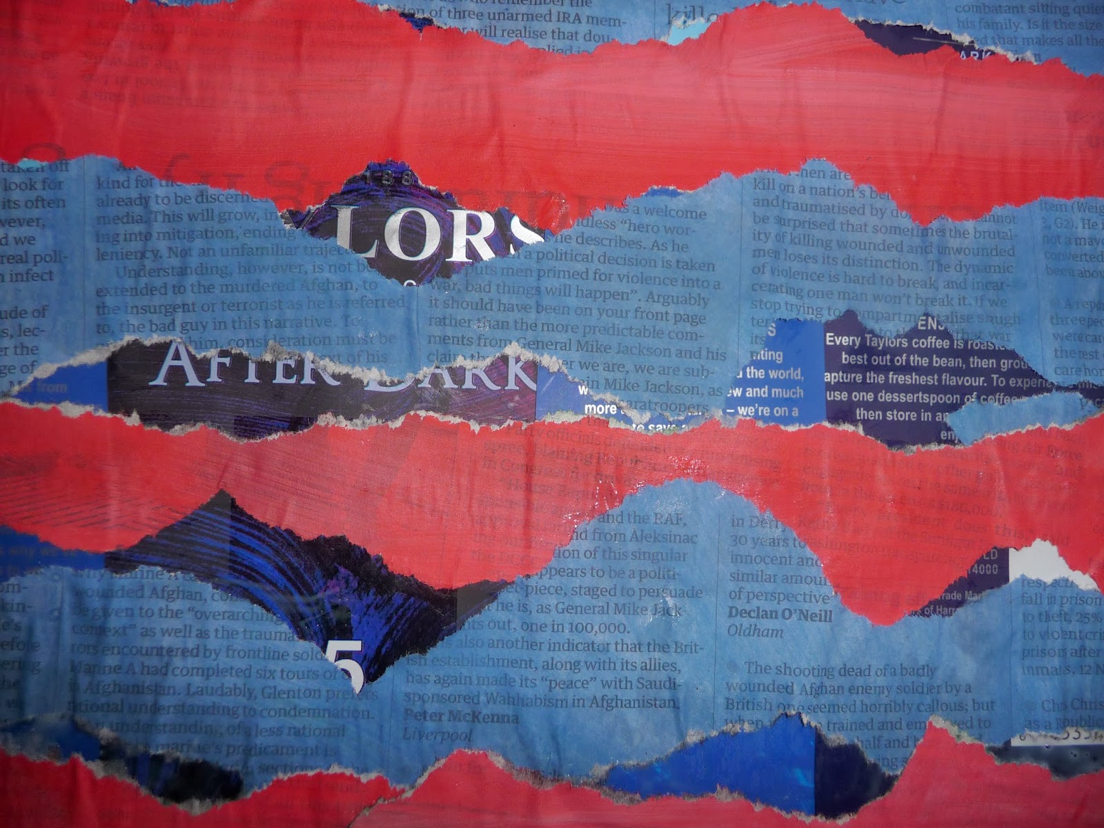 |
I had a couple of empty coffee packets so I cut them up to make a background. I used the painted and torn newspaper and pasted it onto the shiny surface in a random way. I like the fact that the newsprint and the bag both have stripes of print on them and there is a just discernible bar code. There's rough texture from the jagged newspaper and glimpses of a very smooth, shiny background. The words "After Dark" can be seen and the collage really does have a feeling of night time.
I played with the image in Paint.net:
 |
| Crystalise @ 45 cell size |
This breaks the image into crystals but the original image is still very pronounced.
 |
| Crystalise @ 211 cell size |
With a larger cell size the image becomes a bit like a quilt with the shapes very mingled. Whilst the colours in the original don't look blended there is a good degree of blending here. The stripe is only just there.
 |
| Dents |
In this presentation the stripe is very much there and the colour blending not very obvious.
 |
| Ink sketch |
Here the colour is very pale on the newsprint and much darker on the background - there's much more contrast.
 |
| Tile reflection |
This reminds me very much of looking out of the window at the YSP that I used earlier in Part 2. It has the same feeling of "looking through" at you don't know what.
 |
| Outline |
This is my favourite. All the original colour has gone but what has appeared is lots of stripy print and a vista of sky and mountains.
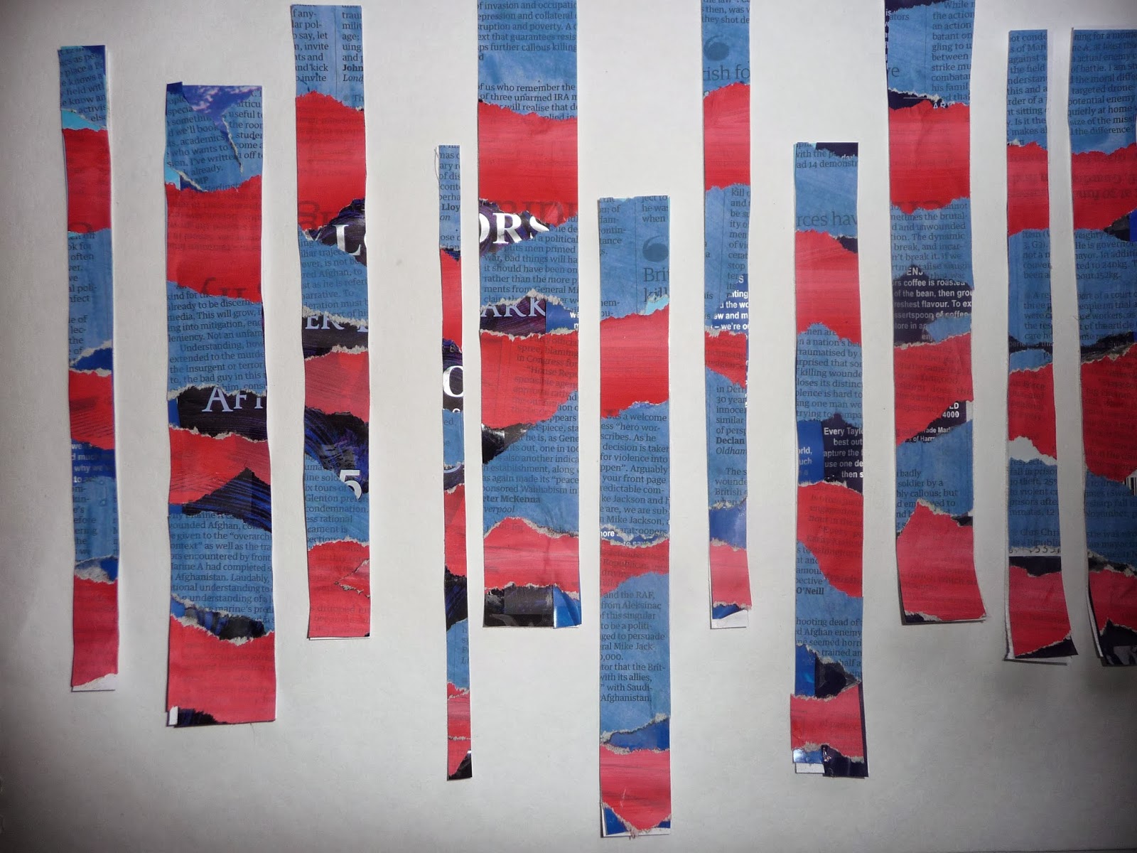
As well as computer manipulation there's always a pair of scissors.
I know that often less is more but it seems that the more fiddling I do the better I like it.
 |
| Cut into strips of various widths |
 |
| It becomes stripes with a contrasting background |
 |
| A variety of angles |
 |
| Staggered heights |
 |
| I imagine these lines crossing at some point |
I know that often less is more but it seems that the more fiddling I do the better I like it.
Just a quick check to see what another background would look like:
 |
| Against newsprint - OK until the colour gets involved |
 |
| Too confusing with the print and little by way of negative shapes |
 |
| Finally I stuck it down |
 |
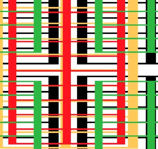
| Multi coloured stripes created in Word |
 |
| Three lots of Twist |
 |
| Dents |
 |
| Tile reflection makes a good repeat pattern |
No comments:
Post a Comment