Of all the things I've tried this once scares me most perhaps because it's a leap into the unknown. I've read lots and found conflicting information. I've been confused about what ink/paint to use and in the end I've bought Selectacine from George Weil. This is a combination of a binder (SF20) and a pigment that should "provide a soft finish (with) outstanding colour fastness". The colours I was warned "are highly concentrated". This didn't make me feel any more confident but in the end decided to just do it.
I taped up my aluminium frame and prepared my work space (all to delay the inevitable).
 |
| I decided to try on paper first |
I used masking tape on the top of the screen. I decided to use my grid idea again but really I just wanted to see how much medium, what proportion of binder to pigment was needed and how the technique actually worked.
 |
| The first print |
In the photo this looks pretty even but in reality there's too much paint and it looks bubbly. I did a second and then a third pull in order to cover the space.
I used 3 teaspoons of binder and 1 drop of pillar box pigment which was enough.
To what was left I added another 3 teaspoons of binder and a drop of aquamarine. I didn't clean the screen because I wanted to see what a mix of colours did. I pressed harder with the squeegee and still I didn't cover the whole surface and should have done another pull.
 |
| The top is on the left o the pull was from left to right |
 |
| The bubbly effect |
 |
| ...and again, it's quite pretty if that's what you want |
I'm not sure what's happening here. It might be to much paint then when the screen lifts the excess is pulled up.
I tried again with less paint. In fact I just added a drop of white to what I had left.

I tried to control the angle of the squeegee so that it used the tip of the blade more effectively but once again it seemed to run out of steam towards the end of the pull. And I still got bubbles.
I'm sure that using paper is partly the problem and the paint is thick and not absorbed as it would be by fabric. In addition my paper was probably too large for a first attempt (A3).
Using calico
I'm reducing the size of my printing surface and using a sticky plastic stencil to print on calico. I cut a simple design of squares.

I wanted to print starting with a pale blue then move the frame and overprint with a darker shade. I felt that was the most economical way of using my materials. I found that the paint left on the mesh provided an unexpected bonus.
The excess that occurred on paper wasn't evident on the fabric thank goodness. Registration is something I've got to get to grips with. I'm using minute quantities of pigment on these one off pieces of work. It would be hard to replicate the exact colour.
As this work dried I noticed that the water content of the paint had bled and taken a shadow of pigment with it. It was OK when the stencil came off so I'm not sure what happened.
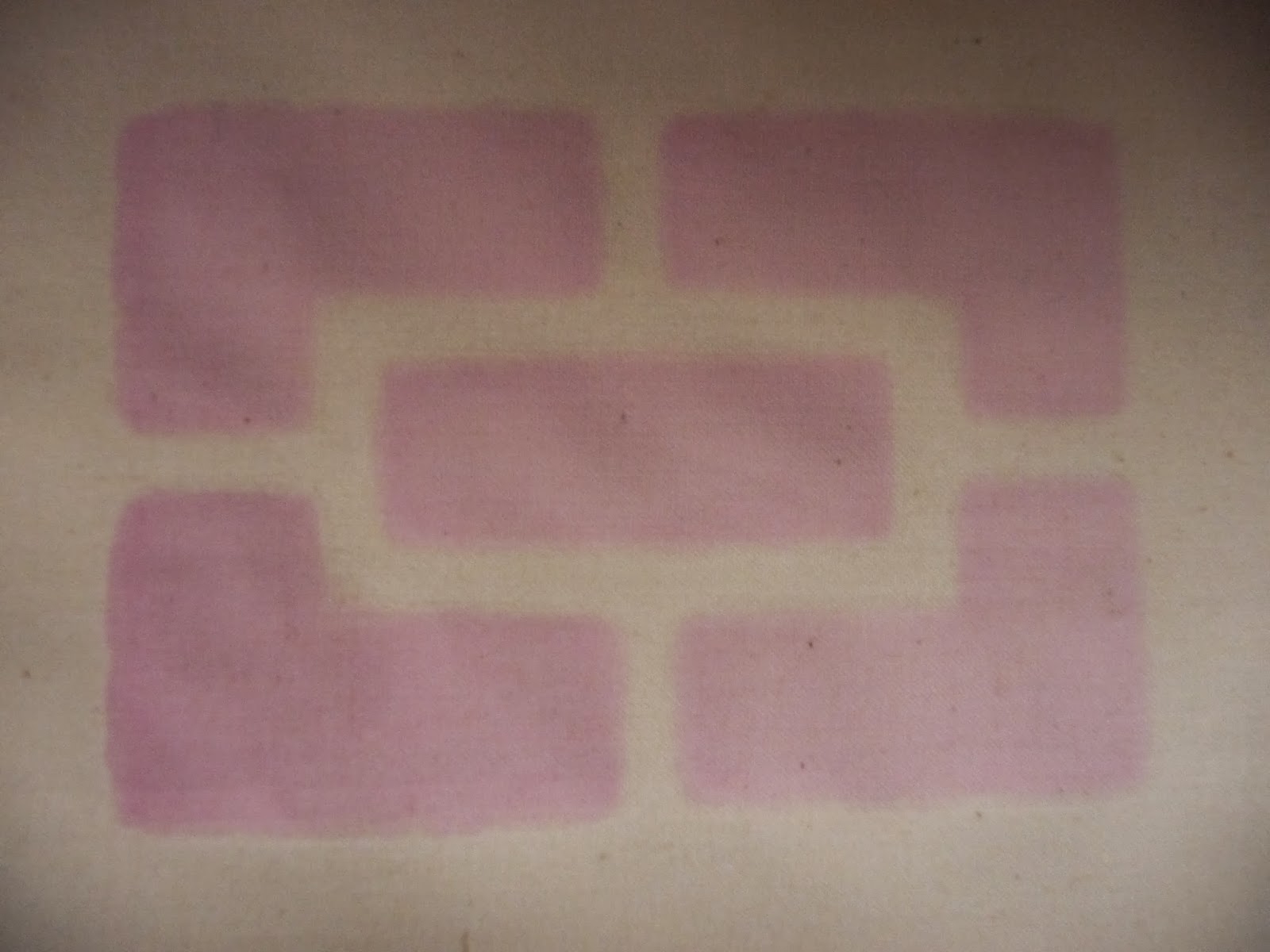
This happened again with my next attempt, again with sticky back plastic, but the marks weren't as obvious because the pink was so pale. The pink was made using my binder and some batik dye whose provenance I'm unsure of. It was by no means as concentrated as the Selectacine. I dried the fabric then printed again with a green that is far too harsh. I'm on a steep learning curve all round even with the intensity of the colours I'm using.

The green bled as well and I'm at a real loss as to how to correct it. With my next sample I'm going to try some other material and see if that makes any difference.

The green motif is slightly smaller than the pink one and it looks very prominent with it's pale partner.

A thing I'm going to have to resolve is the difficulty of lining things up properly. To this end I've ordered some hinges and I'm going to make a dedicated board otherwise I'm going to be tearing my hair out.
Whilst I await my hinges I'll continue to play around with technique. I used some poly cotton to print with torn masking tape and it hasn't bled at all. I used the green left from my last piece of work but made it much softer. I once again used the grid idea but made the lines an irregular shape. Unfortunately I forgot to tape the fabric down and ended up in a mess when I lifted the screen and had to peel it off.

I had another go with some red. I cleaned nothing because my screen wouldn't wait and I got a barely perceptible green tinge to the edge of the red.

I let it dry and taped up my screen again this time horizontally (pic is presented in landscape)

This is the strangest effect; it could almost induce vertigo. The blue jumps out and the red and cream seem to wriggle.

The green background doesn't work in the same way and I'm not sure why. Maybe it's something to do with the colours having less contrast.
As these dried I started to see them differently. Instead of seeing the blue very definitely laid over the green/white I began to see the blue as the background with green/white superimposed. It was the same with the red and blue piece. It reminded me of the optical effects of positive/negative.
I had some green paint left so I tried on some silk. I was so disappointed with it I didn't even take a photo. A couple of days later I had some paint left over so I masked up my screen, this time on the diagonal, and gave it another go:
Technically I have a few difficulties the main one being I end up with too much paint at the top and by the time I reach the bottom I'm running out. I have resorted to all sorts of tactics that no tutor would approve of.
I have looked locally but there are no day courses otherwise I'd do one and get sorted out.
Having said all that I've come a fair distance in a short time and if I can get over the mess I might even enjoy it.
Kinnersley-Taylor, 2003, Dyeing and screen printing on textiles. A & C Black. London
Stromquist, 2004, Simple screen printing. Lark Books New York

I wanted to print starting with a pale blue then move the frame and overprint with a darker shade. I felt that was the most economical way of using my materials. I found that the paint left on the mesh provided an unexpected bonus.
 |
| I printed with light blue and then a darker one |
 |
| I printed with pale blue and got a shadow from the mesh |
 |
| Light blue, dark blue and shadow from the mesh |
The excess that occurred on paper wasn't evident on the fabric thank goodness. Registration is something I've got to get to grips with. I'm using minute quantities of pigment on these one off pieces of work. It would be hard to replicate the exact colour.
As this work dried I noticed that the water content of the paint had bled and taken a shadow of pigment with it. It was OK when the stencil came off so I'm not sure what happened.
This happened again with my next attempt, again with sticky back plastic, but the marks weren't as obvious because the pink was so pale. The pink was made using my binder and some batik dye whose provenance I'm unsure of. It was by no means as concentrated as the Selectacine. I dried the fabric then printed again with a green that is far too harsh. I'm on a steep learning curve all round even with the intensity of the colours I'm using.
The green bled as well and I'm at a real loss as to how to correct it. With my next sample I'm going to try some other material and see if that makes any difference.

The green motif is slightly smaller than the pink one and it looks very prominent with it's pale partner.

A thing I'm going to have to resolve is the difficulty of lining things up properly. To this end I've ordered some hinges and I'm going to make a dedicated board otherwise I'm going to be tearing my hair out.
Whilst I await my hinges I'll continue to play around with technique. I used some poly cotton to print with torn masking tape and it hasn't bled at all. I used the green left from my last piece of work but made it much softer. I once again used the grid idea but made the lines an irregular shape. Unfortunately I forgot to tape the fabric down and ended up in a mess when I lifted the screen and had to peel it off.

I had another go with some red. I cleaned nothing because my screen wouldn't wait and I got a barely perceptible green tinge to the edge of the red.

I let it dry and taped up my screen again this time horizontally (pic is presented in landscape)

This is the strangest effect; it could almost induce vertigo. The blue jumps out and the red and cream seem to wriggle.

The green background doesn't work in the same way and I'm not sure why. Maybe it's something to do with the colours having less contrast.
As these dried I started to see them differently. Instead of seeing the blue very definitely laid over the green/white I began to see the blue as the background with green/white superimposed. It was the same with the red and blue piece. It reminded me of the optical effects of positive/negative.
 |
| Crone or beautiful woman? |
I had some green paint left so I tried on some silk. I was so disappointed with it I didn't even take a photo. A couple of days later I had some paint left over so I masked up my screen, this time on the diagonal, and gave it another go:
 |
| The green is vertical and the purple is on the diagonal |
I have learnt not to write mistakes off too quickly. This is now quite presentable and offers its own optical effects.
Technically I have a few difficulties the main one being I end up with too much paint at the top and by the time I reach the bottom I'm running out. I have resorted to all sorts of tactics that no tutor would approve of.
I have looked locally but there are no day courses otherwise I'd do one and get sorted out.
Having said all that I've come a fair distance in a short time and if I can get over the mess I might even enjoy it.
Kinnersley-Taylor, 2003, Dyeing and screen printing on textiles. A & C Black. London
Stromquist, 2004, Simple screen printing. Lark Books New York
No comments:
Post a Comment