I must have absorbed something over the past week or two because I bought a dress for my grand daughter today and immediately recognised the print as Indian.
 |
| FCUK cotton print |

I like the sinuous lines on the pattern so I took the idea and made a shape of my own. I used my Sharpies simply because I could take them outside easily and enjoy the lovely late September sun. It was a good choice as the colours are vibrant.
I had paisley in the back (the very back) of my mind when I drew this and used colour in a very arbitrary way.
 |
| My sinuous pattern |
There's real drama on a black background; it's almost florescent.

The place I'm going to visit in Jaipur is called Sanganer and I have found they specialise in prints with a white background sometimes even printing on the back and front of the fabric.
Sanganer is popular for its Calico printed bed covers, quilts and saris. In Calico Printing, the outlines are printed first, and then the colour is filled in. The bold patterns and colours are highly preferred.
http://jaipurcitypost.wordpress.com/2013/04/14/sanganeri-block-printing/
 |
| A Sanganer print |
 |
| And another |
Having found these on eBay I thought I'd try my drawing as a repeat pattern and I'm quite impressed with how it looks.

I manipulated the image a bit (Paint.net) and used the black background. How different it looks.

I made a string block to print with using the same shape.

I had a practice print in my workbook. The block was successful and stayed glued even when I washed it.

The print looked like the image I had made but it also resembled an oak leaf. Bearing in mind it's autumn I decided to move away from my Indian theme and do a seasonal collage. I looked in the garden and to my surprise found the main autumnal colours were pinks and yellows. I'd expected to find some orange but found very little.
I put layers of pink and white tissue into my workbook. The layering of the colours gave many tones.

I used the shape of the print to cut "leaves" and then used the block to overprint. I was really hesitant about the pink and yellow colour scheme but I convinced myself that if looked good in the garden it would be OK. It was fine.
 |
| Autumn leaves |
I'm going to re visit some of the textiles I've looked at previously. The first one is a Indian block print with some lovely shapes to isolate and play with.
 |
| My starting point is an Indian print |


I used the curved shape and embellished it with additional length and colour. The positive/negative dilemma is one that has often confused me and at the top of this shape it was hard to know which was which. The white became the positive and flower like. In a less benign mode I can see a rearing snake.
I'm not sure this is going anywhere and even if I like it.
The next one is from the same block print and when this circular part is isolated it has a mechanical feel.

 |
| This reminds me of a wheel |
The central image below is my first drawing with the addition of colour. The satellite images are smaller photocopies.

I can see this would make a block all on its' own.
I then used Paint.net and applied the Dents effect at the default setting.

Although the images were ostensibly identical, when the effect is applied all the irregularities are highlighted and no two images look the same. I don't like this image at all.
So I played some more. I took the smaller of the images and made repeat patterns. I noticed that the more of the yellow motifs I introduced the more the images seemed to move. An optical effect.

 |
| No movement here |
 |
| or here |
 |
| but these flash |
Although this is only a small part of my original image it seems to retain a very Indian feel to it and I'm pleased with that.
I've enjoyed fusing in the past and I thought I'd experiment with this colour combination and circles.
Not a good idea and I abandoned it for one or two reasons.
 |
| First try |
This one was made from red and black carrier bags trapped between clear plastic. I got most of it too hot. The only shape that was OK was the top left one but that was barely fused. I think the clear plastic was a different sort of material and needed a different temperature to melt it.
 |
| Second try |
I mounted these coloured shapes onto white carrier bag and got a better result I planned to stitch in yellow but my cotton broke and I gave up on it.
I'm wondering why I felt impatient with this work and I think it might be that I'd no clear pathway. I'll have to get used to things not working out although I can remember making my final piece for A Creative Approach out of something I'd abandoned.
I may do some more work on this; maybe some printing and stitching.
The second piece I want to work with is a section of the Sujani embroidery from Stage 1. I feel familiar with Indian prints but the embroidery is new to me.
 |
| Sujani |
I've selected a snip that makes me think of summer.
 |
| My snip |
I'm not good with pastels but I think the feel of the embroidery came through in my picture and it suggests other things to me like collage with fabric and ribbon. I like this colour combination very much although I've gone a bit overboard on the blue.
.jpg)
The way the stitches seem to flow from one way to another without really trying is very skillful. It all appears to be running stitch and I think the beige is the background fabric. I have my grand daughters' small weaving card in my box and I think I'll select some yarns and make a small sample and try to get the colours and textures.

 |
| My snip for weaving |

I took another snip of the Sujani:

Then I did a print on calico with Bondaweb:

As I've found before this method of printing doesn't give good colour copy and what I've now got is something much more pink that the original image. I had in mind to gather some strips of fabric and apply them with machine stitching but I think if I'm to do that my scheme will have to accommodate the new colours.
I found that the colour change sapped my enthusiasm and I didn't want to commit too much time to this work. I decided to go with the flow and use the pinks decreed by the print. I followed the lines of the print and placed running stitches in small slits I made in the fabric. My yarns were silk strips, silk tops and some hand dyed wool. I topped it off with some organza stitched on by machine. I then removed most of the organza and it left a hazy feeling to the work.

This is pretty but nowadays I'm finding that just isn't enough. Although I can trace its' provenance it doesn't feel as though it fits; maybe it's the change of colour.
I've been wanting to try some dyeing so I've attempted the sort I researched in Stage 1 called Leheria. The fabric is rolled on the diagonal. My research told me that the fabric should be loosely woven so I tried muslin. I did it twice and no matter how tightly I tied the resist the dye seeped through giving me plain dyed fabric. Undaunted I used some shirting and got the result I was looking for.
 |
| Using the Leheria technique |
This has given a whole range of colour and texture. It looks soft in places but in others it is bright and vibrant. I love the turquoise. It's not a colour I use but I may find it crops up more often after this.
I've become aware that I've been doing a lot of "copying" whilst I've been trying to understand the Indian techniques I've researched. To try to get a bit more balance and break out a bit I've taken a snip of the Mochi embroidery I liked in Stage 1.
I've become aware that I've been doing a lot of "copying" whilst I've been trying to understand the Indian techniques I've researched. To try to get a bit more balance and break out a bit I've taken a snip of the Mochi embroidery I liked in Stage 1.
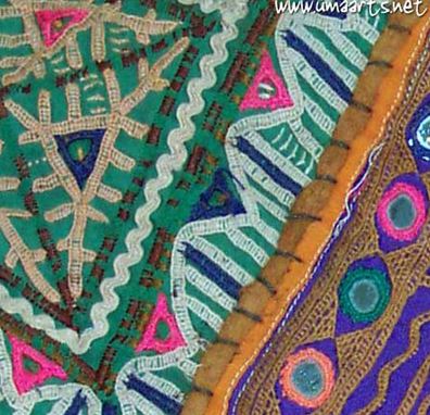 |
| Mochi |
I think the colours are unusual but work well and the piece I've selected is interesting and dynamic.
The pink made me think of Superdrug carrier bags and that led me down the line of trying to use fused plastic. The pink was just about the only colour I could match so really I had to choose bright colours from what I had. I laid turquoise on top of a dark green and them used mainly the sturdy plastic that the handles of bags are sometimes made of so I knew they would lie flatt(ish). I forgot to do a pre heating photo but this is the result.

I hadn't expected to retain so much of the shape sot I'm pleased with the result - I must have got the temperature about right. Although you can't really see it there's some lovely little holes in the turquoise that expose the darker green. The whole thing was very bumpy but I heated it in hot water and put weights on the top and it flattened a bit. This is important because I plan to stitch into this but I'm afraid I'll not have time before my holiday.
 |
| My snip |
The pink made me think of Superdrug carrier bags and that led me down the line of trying to use fused plastic. The pink was just about the only colour I could match so really I had to choose bright colours from what I had. I laid turquoise on top of a dark green and them used mainly the sturdy plastic that the handles of bags are sometimes made of so I knew they would lie flatt(ish). I forgot to do a pre heating photo but this is the result.

I hadn't expected to retain so much of the shape sot I'm pleased with the result - I must have got the temperature about right. Although you can't really see it there's some lovely little holes in the turquoise that expose the darker green. The whole thing was very bumpy but I heated it in hot water and put weights on the top and it flattened a bit. This is important because I plan to stitch into this but I'm afraid I'll not have time before my holiday.
Since I returned from India I've not felt motivated to do any more samples on this part of the course so rather than push it I'm going to write up what I did in India and move on.
http://jaipurcitypost.wordpress.com/2013/04/14/sanganeri-block-printing/


.jpg)
.jpg)

.jpg)