Tuesday 17 June 2014

The end of Exploring Ideas

Sometimes when I finish a good book I'm sad because I just don't want to end.  It's like that with Exploring Ideas because I've learned so much both technically and academically.  Sometimes I almost forget how much has been packed in so a process of reflection is a good idea.  The way I usually do this is to look at my assignments and revisit my Tutor Reports.  I find this both refreshes my memory and sometimes enables new thinking.

Part 1
My holiday in India dominated Part 1 and I was unable to develop useful work using it as my theme.  I didn't see that a contemporary twist might be possible from traditional roots.  Whilst the work I produced was something less than exciting my disappointment with it enabled a lot of learning particularly about the creative process.

Part 2
In Part 2 I was in completely unknown territory and the learning curve was steep.  On a practical level I became more confident as I grew more familiar with my materials and produced some work I was proud of. I missed the opportunity to label my samples in a way that would make them a ready reference point (but I won't do it again).  Probably the most important thing to come out of this section was the need to consider external influences and what I might learn from those with more experience. 

Part 3
I was on firmer ground in Part 3 - I had some technical skills to draw on.  I was able to produce samples that surprised me and research artists whose work was relevant and helpful.  I didn't capitalise fully on the strength of some of my samples probably because I still have some problems recognising what's worth pursuing.  I have a real tendency to re-invent the wheel and make life more difficult than it needs to be.

Part 4
I enjoyed Part 4 so much.  Doing research like this gives me a much better appreciation of the wealth of art available as a resource and introduces me to work that I might otherwise not discover.  I find that even if I don't care for a piece of work I can still learn from it.  I need to be more rigorous with my referencing of web text and images.

Part 5
I've had no Tutor Report for this work yet so these reflections are based solely on my thoughts.  I've tried to pull things together in Part 5 by referencing the work of others, looking at the market and using new ideas that have occurred in the course. I hope I've followed through ideas in a clear and logical way whilst retaining an open enough mind to pursue something when it crops up at the eleventh hour!  Part 5 has left me with lots going on in my head for future work.

Overall
There are three things that stand out as learning highlights

  • Gaining an understanding of the term "key qualities".  This was a light bulb moment and so obvious I could kick myself.
  • Recognising the importance of the creative process and the natural progression of an idea.
  • The benefits to my work of referencing within a contemporary context.

My hopes for Exploring Ideas were very much the same as those I had for A Creative Approach: to learn, develop and be secure in the knowledge the course I have chosen is helping me attain those aims.

I have one disappointment. I used the OCA website extensively when I was doing A Creative Approach; information was easily accessible and the blogs of other students were an excellent learning tool.  I have found the changes to the site have made life far more difficult and nowadays I rarely log on.  


Assignment 5

I can see a clear line of progression from the beginning of this project.  I kept taking things out rather than adding them in.

I spent a lot of time selecting materials and disregarding many like the inclusions in the felt.  I found that grey can have green/blue tones that were not at all appropriate for the monotones I wanted.  I like working with felt because it offers such a wide range of options and it felt right for this work.

It was the black and white collograph that captured my imagination and determined the course I took but it would be interesting to go back to the redundant plate and take it from there using colour. It would undoubtedly mean a whole new range of materials and outcomes.  For instance I'm keen to try more digital imagery directly onto fabric.  My research opened up lots of possibilities around using felt and a light source.

The most exciting stage was when I got the textures I wanted with the simplest of materials and knowing that I had managed to capture the atmosphere from the woods. 

The most arduous time was when I was getting good images but didn't know what to do with them.  I think this comes through very clearly in my blog!  My tutor on A Creative Approach sent me a piece of writing that helped me through this difficult process.  It's called "The Four Steps to Creativity" and those steps are
  • Preparation - processes that may not be inherently enjoyable
  • Incubation - where you don't know you are percolating an idea
  • Illumination - the Eureka moment
  • Implementation -  when everything flows
I'm unsure whether my tutor wrote the words as a handout but I remember her saying the idea was American.  I'm grateful to her because now I'm starting to recognise these stages and relax knowing that eventually the penny will drop.  

I like my completed piece of work although I didn't anticipate what it would be until very, very late on.  I love it's simplicity - with that comes a directness that I like.  Hidden within the piece are layers of other work like the felt and the tree trunks so I don't think I've slipped into being simplistic which was always a danger. "Less is more" is a mantra I've taken on board and I think it works here.

This was the first time I've tried using monochrome and it was surprisingly difficult. I found myself quite resistant to using black in any quantity and used dark greys instead.  I'm still not sure whether this was the right thing to do.  Quite what to do with a piece that requires light was a dilemma that I solved.  I'm still not sure whether my original felt piece would look OK as a window hanging as I had originally anticipated  but the work of Mary-Clare Buckle using acrylic sheet gives me some ideas.  I feel that this work could be just a starting point for a much bigger project.

In some ways I prefer the colouring of the first piece of felt - the wool was a whiter white and the tree trunks were a more vivid silver.  The finished piece isn't very robust and certainly not washable so it needs to be left on it's glass vase without much handling.  

It has become my practice to look at what I've learned by checking it against the assessment criteria.

Demonstration of Technical and Visual Skills
I have developed many new skills during Exploring Ideas and learned to look for inspiration in unlikely places.  A case in point is my fruit bags that nearly went into the bin straight from the laminator.  The benefits of looking for key qualities are becoming more apparent.

Quality of Outcome
I always try to do my best but I sometimes get frustrated when my lack of experience means my expectations are not met.  I have a serious case of wanting to run before I can walk.

Demonstration of Creativity
The difference between interpretation and copying is slowly gaining a foothold and I'm able to use the work of others as a springboard for my own ideas.  This happened with my sketchbook work centred around Lucienne Day.  I'm concerned about plagiarism and I tend to err on the side of caution and I think this hinders my work.

Context
The idea of key qualities has given me a better understanding of how my work fits into a process that has some cohesion.  It's a bit like knowing the provenance of the food I eat.


Part 5 Personal Project Stage 5b


Having decided that light and felt are a good combination I've been looking at how other people use it.  I found several ideas and they all take a different approach.

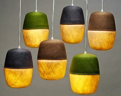
The first one called Mio and is made of two wool felt capsules with the darker top reflecting light towards the bottom to diffuse it.  It is made by a company called City of Brotherly Love. Each lamp is 12" high and 8" in diameter and are about $75 each.

Mio by City of Brotherly Love
http://purecontemporary.blogs.com/behind_the_curtains/lighting/page/14/


I found these lovely lights on a site called I Felt Like It, a South African design house. The lampshades are handmade using karakul wool (karukul sheep are a ancient and hardy Asian breed). They are sculptural and organic in shape and no two are ever the same.  They range from 150mm  to 580mm diameter.

Karakul wool lampshades
http://www.i-feltlikeit.com/index.html

Karakul wool lampshades
http://www.i-feltlikeit.com/index.html

Next I found the Tokonoma range of lights by Aqua Creations is made of merino wool and silk with the supporting structure made of wood.  They are designed by Albi Serfaty and Eitan Ben Tovim.  The four different finishes for the lights represent  the four seasons; Haru for Spring, Natsu for Summer, Aki for Autumn and Fuyu for winter.   

The Tokonoma range by Aqua Creations
http://aquagallery.com/category/column-1/lighting/collection/tokonoma/


Much more like what I have in mind is the Hobo bag and light.  The website tell me that "the bag comes to life with an energy efficient LED light source glowing through its delicate pattern of translucent fibres".


Hobo bags
http://retaildesignblog.net/2011/08/12/hobo-lantern-bag-by-molo-design/

Hobo bag showing the size
http://retaildesignblog.net/2011/08/12/hobo-lantern-bag-by-molo-design/

Whilst I am not actually making a lampshade this research is certainly food for thought.


Sunday 8 June 2014

Matisse Live from Tate Modern


Last week I was lucky enough to go to the cinema to see a live broadcast of "Henri Matisse: The Cut Outs" from Tate Modern.  It was presented by Francine Stock and Nicholas Serota and was 90 minutes of sheer delight.  The event was a one off and as well as a look at the Cut Outs included a behind the scenes look at the exhibition and new dance and jazz from Zenaida Yanowsky and Courtney Pine respectively.

Simon Russell Beale spoke the words of Matisse and clearly had a real affinity with the artist.  There was new footage of Matisse at work and everything was pulled together by interviews with experts who added their own insights.  I know there's no substitute for the real thing but I feel I got a private viewing and a tutorial rolled into one. 

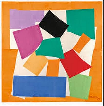
Work discussed included The Snail and The Parakeet and the Mermaid.  

The Snail 1953
www.tate.org.uk
The installation of The Parakeet and the Mermaid at the Tate Modern
www.tate.org.uk

We were shown how and why the hanging decisions for The Blue Nudes were made and that was particularly interesting.

Blue Nude 1952
www.bbc.co.uk


There was also a very informative look around the Chapel of the Rosary at Vence that Matisse financed and decorated.


 Chapel of the Rosary at Vence (1948-51)
www.bridgemanimages.com


I found it fascinating that at the end of such a long, productive life Matisse could invent something so vibrant, sensual and full of movement that was also completely new.

I've gone scuttling back to my copy of  "Matisse: The Master" by Hilary Spurling to immerse myself a bit more.

Spurling, H.  (2006)  Matisse: The Master.  Penguin.  London


Digital Imagery on Fabric


Once again I've been to Patchings Festival and it was there I came across "Digital Imagery on Fabric" by Ruth Brown.  This book is scarily IT based and written by an specialist.  Incredibly I couldn't put it down and it was so user friendly I felt I knew how to explore this technique without having to call in my resident expert.


The idea of printing directly onto fabric is really appealing both for background imagery and stitching guidance.  There are a couple of things to straighten out first.

Can I use an inkjet printer?
The book is very explicit about printers and both can be used effectively so the inkjet I have is fine.

What sort of ink do I have?
I had no idea that there are different types of ink; there's dye based and pigment inks.  For the purposes of printing on fabric pigment inks are best because they can be washed and they are more light fast. At this stage I have no idea what sort of ink I have.

How do I carry the floppy fabric through the printer?
This is the clever bit - the fabric is mounted onto an A4 sticky label and this gives it enough stiffness to go through the printer.

Armed with all this information it's time to have a go.  To give the process a good test I selected an image with plenty of colour; it's part of a floral tribute I made earlier in  the year.


My original image

I followed the instructions to the letter (not hard) and this is the result:


Printed onto white linen - the colours were clear and vibrant

The test for what sort of ink I have was easy; just gently wash the fabric.  So I did. First though I cut my piece in half so that I had a good comparison. I certainly have dye based inks because the colour went straight down the sink


Great loss of colour

Whilst it was disappointing to see this happen it gave me the information I need.

I tried the same process again using pigment inks this time.  The result of the initial printing was not as good as the first sample.  It lacked the vibrancy and had too much blue in it.  However, when I washed half of it the colour was fast.  I think the colour settings need playing with to get it as good as the dye based inks.

Using pigment inks I lost the intensity of colour

Brown, Ruth, 2010.  Digital Imagery on Fabric. SC Publications, East Yorkshire

Wednesday 4 June 2014

Part 5 Personal Project Stage 6


This post will detail the final piece of practical work for Exploring Ideas.  I had intended to make my work into a wall/window hanging but whilst playing around with the effect of light on my work I have found an opportunity to push a bit further.  The picture shows my sample wrapped around a circular glass vase and illuminated from within using an electronic tea light.


My work lit from inside the vase.
It looks very effective and would probably be more so with a small set of LED's that spread the light a little more.  I can see that the undergrowth needs to be higher; probably about one third of the way up the vase.

I set about making more tree trunks; dying more fabric, painting my bondaweb and tearing fabric into strips. While I was tearing scrim I thought how much like undergrowth it looked so I tried it out on some white acrylic felt using some left over tree trunks just to see what it looked like.

I tried two methods - in the first one I laid torn scrim fairly randomly at the base of the trees:

Scrim pinned to acrylic felt

The effect was interesting and certainly ethereal but it didn't look as effective as my stitches.
I tried another way.  I cut a long strip of scrim, gathered it along the bottom and anchored it down at regular intervals.  I slashed and frayed the fabric and got  a quite different look but once again I preferred the movement of my stitching.


 Gathered and anchored scrim 

 I then slashed and frayed scrim with left over tree trunk
Although I would dye scrim in grey colours I feel much more inclined to retain my straight stitches because there's texture and movement in them.

I've ordered some more Merino tops so now I'm just waiting. In the meantime I can get some measurements.

My vase is a cylinder with a 32 cm circumference and it is 25.5 cm tall.  I plan to allow a 4 cm seam which might seem a lot but I prefer to err on the side of caution. Experience tells me that I will need to start with a piece of felt 32 x 44 cm to allow for shrinkage.  I think I will dry felt the seam.  The alternative would be to try to put a tree trunk over the edge but I think that might be really awkward when it comes to stitching it.  I could of course just make a hand stitched seam.  I feel that I don't need to decided now.

The proportions might need to change just a little - I will probably have to use five tree trunks but I will play it by ear when I've made the felt.

When my felt came it was a slightly different colour to my sample - slightly more yellow and my tree trunks are slightly darker.

I followed the same methods as previously so instead of repeating myself this is what happened:

Creating texture with throwsters waste
(against a window)

Creating undergrowth texture with throwsters waste
(against a window)

Creating sky texture with throwsters waste
(against a window)

Testing the felt round the vase
I found that placement of the trunks was vital
 - you need to see three
After much deliberation I stitched six trunks onto my felt

I turned under the uneven edge on the bottom but wanted the irregularity at the top.  The top was higher than the vase but supported by it.  I looked at taking a portion off the bottom but that would mean losing some of the lovely silk undergrowth.  Taking the stitches higher spoilt the long thin look of the trees so they remained low.

Detail of my finished work showing
silk and stitched undergrowth

Detail of my finished work showing
silk and stitched undergrowth

My finished work - in daylight, gently lit

The best way to view this work is in the dark when it is lit from inside.


This is very effective and ticks all boxes I wanted it to.  It's surprising how much light comes through what is essentially wool.

Part 5 Personal Project Stage 5a


It's been pretty hard going at times but eventually it seems to be coming together. Doing a storyboard made me focus clearly on my selections and suddenly life became easier.

I made my felt and cut my tree trunks. I looked carefully at my birch bark markings:

Birch bark markings

I stitched my tree trunks to my felt using irregular straight stitches and three strands of dark grey embroidery thread.


This accomplished I used straight stitches again to represent undergrowth.  This time the colours I used were greys, black (one, two and three strands) and a very little silver (fly stitch).

Straight stitch undergrowth

I've restrained myself from putting too  much in as I think it would spoil it.  I have found that my work has several characters.  The first is demonstrated when it is put against a window. The silk becomes fluffy clouds and the trunks show their constituent fabrics:

Against the window in sunlight


When I lay it on my white table it looks completely different, it's not better, just different:

On my white worktable


Actually the best image seems to be a scanned one:

A scanned image


Because it looks good with light behind it I tried it wrapped around a clear glass vase with an electronic tea light inside:

Lit from inside a vase


Because this looks good I plan to do another piece of work that is made to fit this vase.  I think the undergrowth needs to be higher and I might investigate another idea I've had for undergrowth.  The tree trunks look OK.

I'm very pleased with this work.  It retains the mystery and the essence of the original photo in a very simple, pared down way.  The background felt is subtle and adds a lustre and sheen that have the ethereal quality I set out to achieve.

As sometimes happens in my web wanderings I found the website of Mary-Clare Buckle almost by accident. She creates what she calls "art lights".  These developed from her idea of "floating felt"  The development of these lights is detailed on her website at 

http://www.1-art-1.com/textile-art-light-gallery.html

and is very interesting.  Buckle talks about the way the light source "brings up the pattern of the individual wool fibres".  She also notes that the work looks very different but still attractive with the light turned off. This is just what I have found.

An art light in situ Mary-Clare Buckle
http://www.1-art-1.com/interior-design-art-lights-lighting-ideas-uk.html

Interestingly one of Buckle's developments is to enclose felt between acrylic sheets and then use light.  The website is well worth a look.