Tuesday 29 October 2013

Part 1 Assignment 1

General reflections

I tend to reflect as I go and I don't just want simply to repeat myself but there are one or two things that occur to me that are new.

The whole of Part 1 has been dominated by my trip to India.  It prompted all of my research and I learned a lot about the area I was visiting.  It gave me a real buzz to be able to talk to Indian artists from a position of having a bit of knowledge.

I have found the Indian approach to textiles very traditional and in some of my samples (the fused plastic) I tried to break away from that feeling.  It didn't work nearly as well as some of my printing endeavours.  I like to experiment and I found the limits imposed on me by the Indian theme quite frustrating. I think, with hindsight, that plastic was a poor choice of material and I became demotivated because of it.  When I returned from India I had no interest in picking up where I left off.

What I should probably have done is to experiment more with the Indian forms of embroidery; maybe interpreting some of the block prints in stitch.

I found the work in Stage 4 much more satisfying and I was surprised at the difference in the first piece (a product) and the second one (a more conceptual piece).  I difference was in the remit, the direction it prompted me to go and the license it gave me.

The "product" had a completely different set of criteria to anything else I have done. I was able to use my knowledge of Indian techniques to make a contemporary piece I was happy with.  My choice of materials fulfilled my stated  requirements for the everyday use of a table mat and I was happy with the choice of colours.  

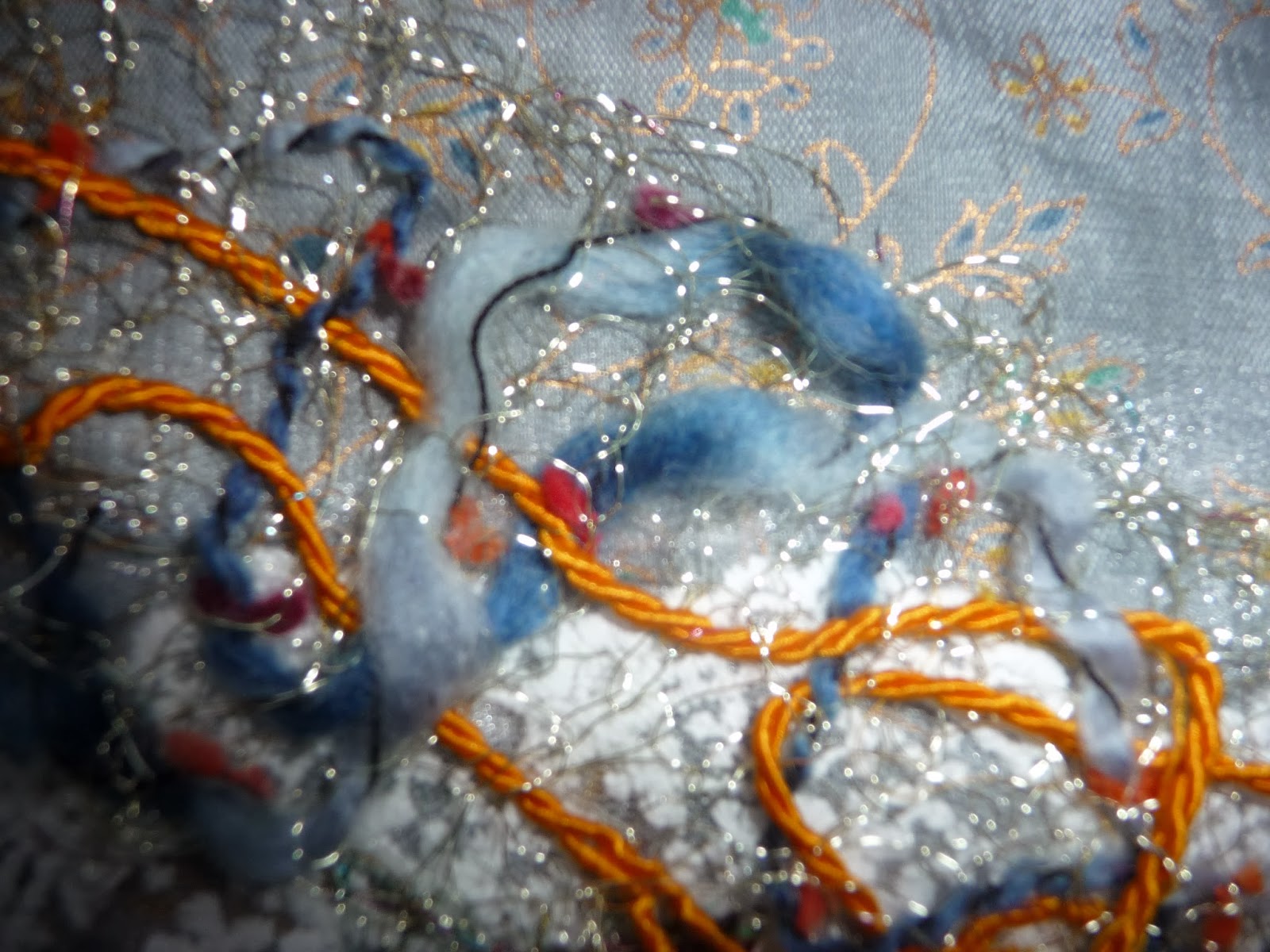
For my second piece I wanted to distill India and I felt quite certain from the outset that to explore the contrasts was the way to go.  I started off going to use Indian inspired applique but it ended up being very different and much more experimental (in my terms).  Once I'd had the idea of knitted chaos it just had to be worked through - I felt quite driven.  I used materials that had meaning for me and typified India.  My reservations are in the reflective part of the specific blog.  My involvement in this work was much more emotional than anything else I have done and I need some distance before I can see it objectively.

I'm looking forward to getting back to normal and using my more usual motivating materials to work from.  I have got so much from my research and trying to put what I learned into practice but in some ways I feel India has placed restrictions on me.

My sketchbook
I've had problems in the past getting to grips with the sketchbook concept and  I've tried hard to use it to explore my ideas and record what I'm thinking and doing.  I have experimented with using an A4 book but I plan to return to A3 because it gives me more flexibility.  I find I need room to move and I don't get that with A4.

In A Creative Approach I found it useful to think about how I was doing in terms of the Assessment Criteria - a sort of self assessment.  I going to do it here as well because it prompts me to think in ways that may otherwise escape.

Demonstration of Technical and Visual Skills
I think my underlying technical skills mean I can tackle most projects without too much anxiety (to date).  Although I haven't tried out all the Indian techniques I could have a good try at them if needed.
My observational skills are improving and I now see things that would have passed me by previously.
I still find it hard to be objective about my work.
I need to concentrate on my compositional skills and refer to basics if I'm unsure.

Quality of Outcome
I think I am organised in my approach and it is easy to follow.
I am fairly analytical by nature and I think I bring this to my work.

Demonstration of Creativity
I enjoy trying things out and I'm getting better at accepting that it sometimes doesn't work out.  The learning happens when I analyse why.
I seem to be developing in ways that surprise me.  I am actually creating and enjoying "chaos" and living with it more happily.

Context
For the first time I have felt an emotional response to a piece of my own work - it felt personal.
I enjoy the research and like to look for applications.


Cloth and Memory - Study visit

On its own Salts' Mill is a wonder to behold.  If you add in a world class exhibition something quite extraordinary happens.

23 international artists were asked to respond to the Spinning Room space at Salts Mill.  The room is 168 metres long and when you walk in it takes your breathe away.  The artists we met described the same feeling and it must have been terrifying to know there was some sort of response required. Aside from the impressive work the thing I found most remarkable is that no two artists came up with anything at all similar to each other.  Each interpretation of the task was completely unique. That helps me to understand that the tasks I am set on my course can be interpreted very widely as long as I have the dialogue to show my rationale.

When I go to an exhibition I try to focus on just one or two artists I particularly enjoy.  At Salts' Mill this was impossible.  The work was outstanding but the enthusiasm of Lesley Miller, the curator who led our tour, was so infectious it was beyond me to select a favourite.

There were some pieces I found very moving.

Peta Jacobs huge devore image of the movers and shakers of the Bradford textile world in the mid 1950's was very poignant by virtue of the men being supremely confident yet so vulnerable. This is not a description the men would have welcomed or expected. The vulnerability was accentuated by the fragility of the fabric Jacobs made, almost ghostlike.

Caren Garfen
My inclination is always to "people" places like Salts' Mill  and Garfen makes it easy.  Given the right circumstances (privacy and time) this could easily make me cry.  Garfen highlights the women who worked at the Mill by making small plaques exquisitely made and minutely stitched.   She gives them life with names, addresses and which mill they worked in. Unlike the wealthy men in Jacobs work these women were vulnerable not to social change but to the harsh working conditions prevailing at the time.  These women are largely forgotten but this work may provoke memories as local folk recognise relatives.

Reece Clements is one of a long line of family members to contribute to the history of the Spinning Room and it is probably this connection that makes his work so powerful.  The family layers are echoed in the multi layered approach to his exhibit and it is interesting that it is the surrounding architecture that has this power.  There is a feel to this that I find hard to define.  

There was other work that I found fascinating and inventive.  Kari Steihaug's unravelling jumper. Yoriko Yoneyama's suspended web of rice threaded on fine cotton and Caroline Bartlett's intriguing approach to using embroidery hoops.  How I kept my hands off the felt ledgers by Jeanette Appleton I'll never know.

It seems very simplistic to say I loved it all but it would be quite true.

The seminar in the afternoon was well attended but the conversation with the artists was quite intense and  very revealing.  It gave me another way of thinking about and valuing my own work.  I feel privileged to have seen Cloth and Memory and its impact will be evident in my work forever.

What is cloth to me?
This is the question asked of various people in the exhibition catalogue and it prompted some thoughts of my own.

To me cloth defines time. From being very young I remember events by the clothes I was wearing. Pick an event and I'll tell you what I was wearing, where it was from and probably how much it cost.

As a child I treasured hand me down clothes because I admired the bigger girls who had worn them before me and sometimes left their mark.  To this day I can feel the texture of a pink lacy dress I loathed (I was 3).

How my mother afforded it I'll never know but she bought Viyella fabric and had school blouses made for me - my first experience of quality cloth and the notion that cloth can be sewn.

I was in trouble at school for asking for "proper" fabric to sew not the standard issue binka and for being picky about the colours.

This question has prompted lots of thinking and memories.


Monday 28 October 2013

Part 1 Stage 4 (2)

Selecting designs for a specified outcome (2)

India is a country of contrasts; wealth and abject poverty, city chaos and mountain tranquillity, openness and corruption, vibrancy and drabness.  It has a social order and has perfected bureaucracy.

When a rich heritage and a strong sense of identity are thrown into the equation the complexity that is India begins to emerge.

In my sketchbook I have developed an image I want to pursue in fabric.  I want to create something that will express some of the contradictions. 

Chaos and tranquillity
The chaos dominates the tranquillity as in life. 

I've cut out the shapes so the colour shows through the mountain picture, a bit like reverse applique.
I'm going to try to do just that; reverse applique for the major shapes and some phulkari embroidery for the smaller shapes.

First I need to represent the tranquillity of the mountains and these are the fabrics I've chosen. Except for the lace they are all from the bag of bits I was given in Sanganer.


I like the way the creases look like folds in the mountains.  This is how it turned out:

I was reluctant to hide the lovely lace and the mountains are a bit too prominent.


Trying the larger shapes (possible applique)


It's decision time.  Do I try to alter the prominence of the mountains or not?  Additionally I'm getting cold feet about the reverse applique and how fiddly it will be.

I woke this morning with an idea and it made the applique redundant.

I thought I could knit chaos in .2 wire and weave through it - I couldn't wait to start.  Take it from me that knitting with wire is not like knitting with wool.  I did 12 rows with 20 stitches and it was just what I wanted; fine, open and pliable.  Whilst I intended  the wire knitting and subsequently the sari silk, to be  samples they both looked so right I used them as they were. 


I selected a range of  yarns to thread though but only used two; a blue novelty yarn and some yellow linen.

I  tried sari silk but it was too thick but I wanted to use it very much - it is so appropriate.  I decided to knit some of it in a messy, chaotic way. Once again chaos reigned.  I added some copper mesh because it offers a more controlled, regular mess and put jute (an Indian staple) round a mount. The mount is part of the work.  It seemed important to contain the work; I don't deal well with chaos!

Although I didn't stick with the original plan (and it's there to pick up later if I want to) I'm pleased with the outcome and I enjoyed doing it.  I've tried to show two conflicting aspects of India that impressed me - the calm and the chaos.  The background is calm but the chaos takes over and comes from every direction and in many forms.  It is interconnected with the rest of life and dependent  on everyone obeying unwritten rules to avoid danger (the copper mesh).  

This work has coincided with the study visit to The Cloth and Memory exhibition at Salts' Mill. Prior to the visit I'd done some reading and it seemed very relevant to my work.  More so after the seminar. My photos were themselves a prompt for memories of my trip to India. 


I used fabrics that provoked memories, the wire made me remember my course with Helen Meakin and now the finished piece holds memories of its own.  How did I never think of this before?

This seems a very cursory mention of an exhibition that will probably change my work for ever.

Probably tied up with the idea of memory I noticed an emotional involvement that I've not been aware of before.  It has meaning.


Unfortunately I got so into what I was doing I didn't take any photos. This however, is the result.


The reflective bit...
I think this is a very busy piece of work and my artistic feeling is that the mountain background should have been more subtle; less undulations and texture and more muted blues and greys.  Less obvious perhaps.  The initial work was done with another intention (the applique) so the "chaos" sort of inherited it.  That said I also feel that each component, calm and chaos, should have equal prominence and if the result is over busy that's how it is, just like India.

I don't think it's an accident that the careful planning of my applique chaos was abandoned in favour of something more impetuous; it seems very fitting that the work should make its own demands.

Chaos is what makes India exciting.

Tuesday 22 October 2013

Sketchbook work

Selecting designs for a specific outcome (2)


This was the view of the Himalayas from the terrace where we ate breakfast.  The mountains look blue but in fact on the lower slopes (8000 feet +)  they are covered in pine trees.  To cut a long story short I played with the image on Google Maps then on Google Earth.


The image on Google Earth


A bit closer

I took a bit of a wander and found some snow


I love this lower image and I tried to interpret it with fabric dye.


I think this has turned out a bit linear.

The tranquillity of the mountains was in stark contrast to the busy chaotic cities; they were noisy, sometimes dirty and appeared totally disorganised to the uninitiated (me).

I took photos of electrical cables because they were so unbelievably dangerous.

Cable chaos

Cable hell


Closer cables
 I thought this was a good image to work with so I used Paint.net and applied the "outline" effect.


I outlined the negative shapes and got what looks
like a road map

I made a repeat pattern.  I'm sure I've seen a similar Ikea print


I manipulated it to an A4 size and chaotically
coloured the shapes with my Sharpies


Chaos - alternate tiles turned through 180 degrees


I made the image into A4 size, cut out the major shapes and so the colour showed through the tranquil mountain photo.


Instantly it felt chaotic; the contrast was so overt.  I wondered if this could be represented in fabric so I'm moving away from my sketchbook towards my sewing machine.


Part 1 Stage 4 (1)

Selecting designs for a specific outcome (1)

As I've commented before Indian textiles are traditionally produced  and don't seem to be innovative. They have a key place in the identity and culture of the Indian population.

But I'm not Indian and the textiles are not in any way sacrosanct so I'm going to mess with tradition a bit.  I want a more contemporary product.

Choose one design idea to be developed towards a product.
I've decided to make a table mat and use the block printing techniques that have absorbed me so much.
The reason I've chosen this is because it's so hard to find attractive mats that fulfil all the necessary functions.  They have to be:

washable
durable
attractive
have insulation properties

In addition the idea of a "product" raises the notion of consistency, cost (including time) and availability of materials.

In my research I've found that Chandni Chowk have a good range of block printed tableware.  They are lovely but very traditional.


I expect the central print is done by the four metre length as I found in Sanganer.  My attempt will be a one off so it will not be an all over design like this.

http://www.chandnichowk.co.uk/Site_pages_Fair_trade/InteriorsPages_Fair_Trade/Tablewear_Pages_Fair_Trade/Placemats_Napkins_Hand_Block_Printed_Fair_Trade.html


Many are really complex patterns and may be an acquired taste.


When I look at stores like M&S it's all pretty pedestrian but at the moment there is a very definite slant towards Christmas goods.

In Stage 3 I made a printing block out of string and it was quite successful on paper.  For my table mat I've considered using the same block on fabric.

My block
Trying it out

Using it on a tissue paper background
However, I've abandoned that idea because the block is now well worn and considering it is string and PVA it may fail.  I have several traditional wooden blocks and decided on a large paisley design.  I also wanted to use my small flower from my trip to the museum in Sanganer
.


In Indian household textiles the base fabric is usually white.  Because my printing will be comparatively simple I've considered using a patterned fabric for my base.  I could tie dye or use some batik left over from a skirt but when I looked I didn't have enough.

I have a piece of osnaburg that has an interesting texture, is durable and could give the contemporary, homespun feel I'm looking for.  Time to sample.

Trial on paper
Trial on paper


I tried both linear and random designs on paper and decided on random.


Gold paint on osnaburg

then overprinted - much better 


I thought gold paint might work on fabric but it didn't until I overprinted with colours.


I tried my flower block on some binding


In India the traditional way to attach the batting to a quilt is by many rows of running stitch.  I was mindful of the time involved so did a test piece where I did running stitches and some machine lines as well.  The hand stitching won hands down but took ages.  On reflection I should have tried a decorative machine stitch that would have looked more substantial.


I knew that I'd have to make some mitred corners so I had a go and it worked quite well.


The tutorial I used was really clear.  Find it at     

http://www.youtube.com/watch?v=WsFOIndc3J8

So much for the sampling.  Here's the finished place mat which has unintentionally become reversible.


There are couple of things to record.

Firstly it surprised me that the quilting took up so much material.  I started with two identical pieces of fabric but after quilting they were about 2 cm different.

Secondly I don't think the flowers on the binding are necessary; It overdoes things a bit; the plain binding on the sample is fine.

This feels like a very reactionary piece of work but as a "product" it would have to be commercial so maybe that's OK.  Although all the processes I've used are of Indian origin it is very different from the textile work that has inspired me but if it wasn't I'd just be copying.


Friday 18 October 2013

Amritsar

Textiles were not supposed to be a highlight when we visited Amritsar - in fact they were a bit of a bonus. The gallery we visited dealt in antiques, carpets and household textiles.


I explained that I was doing a course and the owners' wife showed me items that demonstrated a wide variety of techniques many of which I knew something about from my earlier research.

Phulkari

Front


Back
More phulkari


And more - it's so varied in it's density and design


Pashminas


Incredible optical effects on a pashmina

Silk embroidery

I wanted it all

Thursday 17 October 2013

Sanganer

Sanganer was supposed to be the textile highlight of my holiday and I'd a lot planned.  Instead I was confined to my hotel with the dreaded Delhi belly and only managed to spend half a day on my activities.  Even then I was a bit out of it if I'm honest.  So very disappointing.

Salim's Paper.

It was lunchtime when we visited Salim's Paper and the workers (mainly women) were taking a nap.  We were shown the process of making paper from shredded cotton (see link above).  The shreds are put in a huge vat with water and dye.  The resulting mush is floated onto a mesh tray and the solids settle into an even sheet of what will become paper.

Pulped cotton being dyed


Fibres are scooped out of the vat on a metal mesh
and jiggled until they are even - just seconds

When the water has drained a little the fibres are removed
 from the mesh - again just seconds

and put to dry for a while


A  roller flattens the paper

The machinery looked ancient but the paper was of really high quality and very varied (see website).
I saw carrier bags for a prestigious French store being assembled and having their sari silk handles attached.


Posh carrier bags

A shop full of paper goodies


Jaipur Blue Pottery
Jaipur is famous for its blue pottery ad we visited the factory.  Surprisingly the pottery is not made from clay but from ground up marble, powdered glass, gum, borax and water.  The resulting paste is shaped over a former and fired at a low heat for many hours.  The failure rate is upwards of 40% which is very high.

The items made are usually small, trinket boxes, ashtrays, vases and the like are typical.  The predominant colour is cobalt blue.

Jaipur blue pottery


Block printing
http://www.anokhi.com/


Anoki is an Indian clothing chain but unfortunately it was one of the activities I hadn't time for.

Part of the enterprise is the Anokhi Museum of Hand Printing which was tucked away in a little side street and virtually deserted.  I could have quite happily spent a week in this place.  Check the link above to get a flavour of what is on offer.

http://www.anokhi.com/museum/

These are few of my photos:


Complex tie dye

Block printed samples

This waistcoat went through 11 printing processes

A large printing block

This man was carving blocks out of teak

Making small motifs.  Note the precise marking out.

Four blocks make one image


Another interesting website is that of Chandni Chowk.  It is full of information and sells ethically produced goods.  Find it at:

http://www.chandnichowk.co.uk/Site_pages_Fair_trade/Product_Info_Pages_Fair_Trade/About_us_fair_trade.html


We spent some time at Parwati Exports in their block printing workshop and I made a print (with help).


The blocks


The first print 


The second print


The third print

The fourth print

After chemical curing of the print

Usually the printed fabric is put in the sun to cure but we didn't have time hence the chemicals.


The expert

The precision with which this man worked was amazing.  The fabric was 4 metres long.

I don't often buy things when I'm away but in the shop attached to the workshop I made some purchases with Christmas in mind.  These bathrobes were made for me and delivered the next day.


Hiding in these pouches are mother and daughter robes


In the same shop I bought a beautiful, hand sewn, cut out applique throw.  I love the white on white, it seems to accentuate the complexity of the design.


I sweet talked my way into acquiring a bag of fabric scraps to add to my stash.

My Kindle is there for scale - wasn't I lucky?


Vastratex 2013
Our guide had heard from a friend that there was an international textile fair close by and he did us the great service of blagging us entry.  It was like a time machine had transported us back to the 1960's with stand after stand displaying clothing and household textiles from all over India.  I don't know how convincing I was as I posed as an international buyer but it was quite an experience.


What I realised as we walked round was that nothing much seems to change in Indian textiles.  The traditional skills are used to make traditional designs.  The creative and innovative way I'm being encouraged to work just isn't evident.

It was at this point that I had to return to my hotel.  I missed tie dye and screen printing trips and there was no chance to try again the next day as we had a flight to Delhi booked.