I have a photo of the beautiful roof in the Corn Exchange, Leeds and I want to develop a print from it.
It is another variation on the theme of a grid but no two shapes are quite the same.

I chopped a bit out and outlined the shapes in alternate black and red.

I made two stencils from sticky back plastic; one with the black shapes cut out and the other with the red ones removed.
I printed the first stencil onto paper

and when I was happy with the position I printed again on acetate so that I could match up subsequent prints. I marked the position of the acetate on my base and lined up each piece of fabric to that mark.
Once again I used calico but I found a bit of deep pink/purple as well and I wondered how the colours would look on darker fabric.
 |
| I got a good crisp print |
 |
| This is brighter than in reality |
Because I'd had some difficulty getting a pull to go right to the bottom of the screen I took off the pads at the foot of the screen and hey presto it worked and a pull made contact all the way down the frame.
Because the weather is damp and it's taking ages to dry I'll have to wait until tomorrow to do the next bit.
Next day...
Getting things lined up was tricky but here's where the printed acetate came into its own. I did one pull on paper then set up:
 |
| Making sure things line up |
 |
| There's a little bleeding but I'm pretty pleased with this |
This seems a simple enough design but it was a real test of logic and organisation.
On the darker cloth things are much more subtle.

I found this video helpful.
http://www.youtube.com/watch?v=bOv6-Mlv0Ls
Some time later....
 |
| I put marks between the shapes to represent the roof bars and introduce a little of a third colour |
I've had some problems getting a bright green but here it is at last. My blue is very strong and I've always been heavy handed with it. This is lots of yellow and a smidgen of blue.
 |
| And on the darker fabric. Interesting effect |
It is clear that this doesn't work; the fabric needs to be paler than the printing medium. I think this leads nicely into discharge printing.
I've done this with left over paint and the sticky back plastic stencil I've just used:

Another idea
I had the idea that I'd like to try a screen printed, checked design with some blending of colours. I cut a stencil from sticky backed plastic and planned to use it once vertically and once horizontally. After that I wanted to change the colour and repeat the process but slightly offset the pattern.
What I didn't take into account was that for this to work my image needed to be square. This is what I ended up with.
 |
| When I wanted to turn my pattern round it didn't fit so I just proceeded with the second colour |
 |
| After batching it had bled but it was quite attractive. |
Much later....
It's a long way down the line but I've finally managed to try this again. This time I've used my Selecticine and some silk. I've not used silk often but this time I wanted colour on both sides and Selecticine tends to be a surface dye.
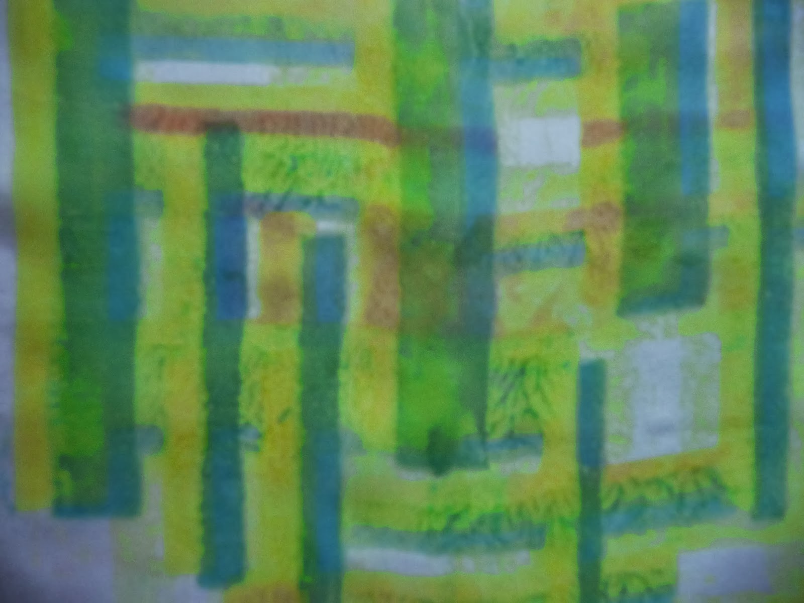 |
| I used ultramarine and yellow and got a range of greens as well |
I'm not entirely sure how I feel about this. There seems to be lots of "puddling". Whilst it adds some texture it's not what I wanted. I'm unsure why this happens. Earlier I though it might be too much medium but this time I curtailed it. A question for my tutor perhaps.
There are obvious red lines in the pattern. This is the residue from my drop cloth and the magenta Procion I used in the last sample. It's interesting to notice that the magenta line is broken where there is no dye. I imagine this is because the silk is damp and the magenta leeches through. Time to change my cloth then! The added colour is quite a bonus though.
 |
| My beautiful drop cloth. |
I thought the drop cloth would eventually become mud like but it has retained everything I've done and is quite a history of Part 2.
No comments:
Post a Comment