My final choice came down to two in the end; the waving grasses or the card print.
.jpg)

I've selected the grasses mainly because the scarf is almost weightless (62 gms) and the design offers a lightness that complements it well. The season I'm aiming for is Spring/Summer so grasses blowing in the breeze is a suitable motif.
Whilst I'm pleased with the card print design it is fairly chunky - quite the opposite of the grasses. I could try it in a lighter combination of colours but there will never be any frothiness because the lines are so closely spaced - and that's part of their appeal.
I know that my coursework doesn't require me to actually produce a finished scarf but I'm lucky enough to have both the scarf and the time so that's where I'm aiming.
Out for a frosty walk this morning I took photos of elephant grass which I think is used for biofuel. If I can get this sort of movement in my design I'll be more than happy.

I now have some thinking to do:
what will my colour scheme be?
how will I use my colours considering I want to dye my scarf before I start to think about painting.
should I do lots and lots of fine brushstrokes like my drawing or should I scale up?
should I use bleach or a discharge agent?
how will I make sure my long strokes show movement and are not stiff because of their length?
Additionally I have no other cotton batiste so my sampling will have to be done on the "wrong" fabric.
I'm going to select a palette from the 2014 colours I saw on the Pantone website and my first task will be to try to re-create them with my dyes. For me the colours exude the warm and calm of a lovely Spring day.

I looked at the colours I mixed yesterday to see if I had anything approaching what I want. What I found was that my colours are much more vibrant than those of Pantone. The only ones than come anywhere near are the purples. This is disappointing because I thought it might give me a toehold to build on.
So far, and I'm only 2 colours in, this is proving to be pretty difficult. I seem to need a white to get some softness to the Freesia and to the Hemlock. I'll see how it feels tomorrow.
So far, and I'm only 2 colours in, this is proving to be pretty difficult. I seem to need a white to get some softness to the Freesia and to the Hemlock. I'll see how it feels tomorrow.
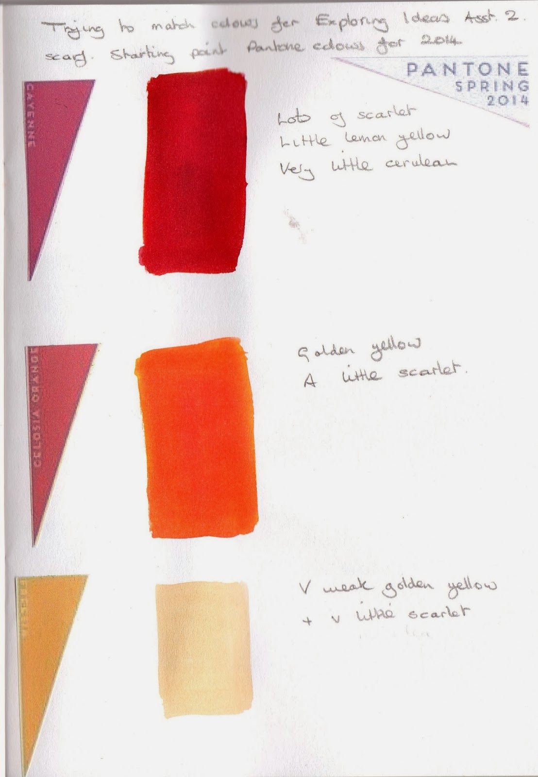


There's just the density of the colours to think about now.
Working with the Pantone range of colours I've selected those that remind me of my garden in Spring.
The yellow of the daffodils (some with orange centres) blue scillas and purple crocuses are all in my palette. Although Pantone offer a rather subtle range what I've chosen is from the brightest. In reality my colours will be quite inaccurate for all the reasons I've alluded to previously. However, if what I produce is attractive I'll be happy.
 |
| The palette for my scarf |
Depending on the delicacy of the tone I can manage for the Hemlock base I'm hoping that the stronger colours won't be too heavily influenced by it.
I haven't any batiste to try out my dyes so I've stitched together a range of fabrics in a similar off white colour to my scarf. There's a variety including muslin, linen, calico, silk and a twill. I'm going to immersion dye them Hemlock which is my fairly neutral base and see what happens. I expect to get a wide range of results. If there's a colour similar to the one I'm aiming for I'll try out the other colours I need on it.
 |
| The outcome of my dyeing |
The results were interesting. There was nothing that came very close to where I was aiming but the best were the silk, muslin and linen. The muslin is about the closest fabric to the batiste. The crinkle cotton and the poplin must have some synthetic in there somewhere because they are barely coloured at all, the twill was quite blue and the linen fairly apple coloured.
Before I dyed my samples I put some of the dye in my dye book and it looked substantially darker on paper than it did on the fabric. I'm going to try all my colours on paper just to see what happens. It seems a very inexact way to work that really requires much sampling before the event.

What should have been yellow looks far too orange and the whole thing look like it needs the lighter yellow so much.

I added some lighter yellow but now it is in danger of becoming too busy.
Tomorrow I'll try my colours on the muslin and linen, as well as discharge paste and bleach and see which works best.
I've found that the watery dye I need for the right colours spreads far too much on the fabric at the start of my brushstroke. This happens on both the linen and the muslin.
 |
| Linen |
 |
| Muslin |
As the weave on my scarf is fairly open (although not as much as the muslin) this means I have to do some thinking about the consistency of my dye. Currently I have small bottles with a quarter of a teaspoon of dye diluted in a fluid ounce of water and to get my pale colours I've diluted further. This worked OK on paper.
I mixed more concentrated colours:
 |
| More concentrated colour |
and whilst it was better the colours were far too dense and didn't go on smoothly.
I wondered if thickening the dye would work so I mixed some yellow with Manutex and tried it out. At first it was too thick and didn't brush out at all but gradually as I added water it became more manageable. I think this might be the way to go.
 |
| Using thickened dye prior to ironing |
 |
| and after heat setting |
My original idea was to sample both bleach and discharge paste - those marks will be the first I make on my scarf. I've tried discharge paste and it gives the result I'm after so I'm not going to pursue the bleach at all. Bleach is much more unpredictable than discharge paste and I feel as though there's enough unpredictable around without adding to it.
 |
| Thickened dye and discharge paste |
I have to give careful consideration to the brushstrokes I'll be using. It's important that the stroke is spontaneous and has movement and vitality. It's also important that the marks look in proportion to the size of the scarf. To this end I put newspaper on my table to represent the size of the area of the larger panel. I assembled a range of brushes I thought would make the right sort of marks and mixed some acrylic paint to the same consistency as my thickened dye. The outcome was yet another surprise
.
The marks made with the chunky brushes were just that - chunky with no possibility of any taper towards the end of the grasses.
The small brush at the top of my photo is the one I've been using throughout this work. I thought the marks it made would be too fine for the scale of the scarf. Instead it worked really well and I could get the sweeping stroke I needed with relative ease.
The Outcome
The scarf journey seems to have been a long one and I've learned a lot along the way. Here's a reminder of what I was aiming for
Spring/summer colours
a light feel
plenty of movement from long sweeping brushstrokes

Did I get those things? Yes I think I did but there are some things I changed along the way and some I wish I could change now.
First I dyed my scarf a colour based on the Pantone Hemlock. It dyed well - no patches. I used discharge paste to make my first images on the scarf but the delicacy of the Hemlock meant that it was hardly worth the bother.
I mixed enough thickened dye for both ends of the scarf. The impact of Manutex on the dyes was something I'd overlooked. Working on the principle that you can always add a bit more but can't take it out, it took me a long time to get a depth of colour I was happy with. At this point my adherence to Pantonne became even more tenuous.
My intention was to print at the ends of the scarf; from one end 85cm in and from the other end 70cm. I decided to try the shorter length first to get my eye in. I'd had dummy runs on paper to get the movement right but when it came to fabric it was very different. Even though I was doing the shorter length I was unable to get the free grass feel I was after. In order to have my dye reach the top of the grass I loaded my brush heavily and got too much on initial impact with the fabric.
In my anxiety to get some dye to the top of my design I put in too many strokes and ended up with something I consider looks far too busy.
I decided to make the design on the opposite end of the scarf considerably shorter to try to get over the problems I'd encountered. It worked much better.
Because there was less dye on the brush the colour seemed less intense and the whole feel was less frantic.
I rinsed the scarf and soaked it in Colsperse and although no colour ran the colours looked more subdued at the end of the process.
I think the most important lesson is that you should always do tests on the fabric you're planning to use.
As a learning experience this has been a good one but I'm afraid my scarf will be a very limited edition!
 |
| My brush selection |
 |
| Marks made by the lower 5 bruhes |
 |
| Blue marks made with the top brush in the picture |
The small brush at the top of my photo is the one I've been using throughout this work. I thought the marks it made would be too fine for the scale of the scarf. Instead it worked really well and I could get the sweeping stroke I needed with relative ease.
The Outcome
The scarf journey seems to have been a long one and I've learned a lot along the way. Here's a reminder of what I was aiming for
Spring/summer colours
a light feel
plenty of movement from long sweeping brushstrokes
Did I get those things? Yes I think I did but there are some things I changed along the way and some I wish I could change now.
First I dyed my scarf a colour based on the Pantone Hemlock. It dyed well - no patches. I used discharge paste to make my first images on the scarf but the delicacy of the Hemlock meant that it was hardly worth the bother.
I mixed enough thickened dye for both ends of the scarf. The impact of Manutex on the dyes was something I'd overlooked. Working on the principle that you can always add a bit more but can't take it out, it took me a long time to get a depth of colour I was happy with. At this point my adherence to Pantonne became even more tenuous.
 |
| Beefing up my colours |
My intention was to print at the ends of the scarf; from one end 85cm in and from the other end 70cm. I decided to try the shorter length first to get my eye in. I'd had dummy runs on paper to get the movement right but when it came to fabric it was very different. Even though I was doing the shorter length I was unable to get the free grass feel I was after. In order to have my dye reach the top of the grass I loaded my brush heavily and got too much on initial impact with the fabric.
 |
| Lots of dye as my brush touched down |
In my anxiety to get some dye to the top of my design I put in too many strokes and ended up with something I consider looks far too busy.
I decided to make the design on the opposite end of the scarf considerably shorter to try to get over the problems I'd encountered. It worked much better.
 |
| Shorter brushstrokes - less dye - less blobby |
I rinsed the scarf and soaked it in Colsperse and although no colour ran the colours looked more subdued at the end of the process.
I think the most important lesson is that you should always do tests on the fabric you're planning to use.
As a learning experience this has been a good one but I'm afraid my scarf will be a very limited edition!
What a fascinating account. Certainly a learning curve for you. The edge of an old credit card works well for getting fine sweeping lines too when used with thickened dye.
ReplyDeleteCrack the BFUHS PPMET exam with Mantram Nursing Academy’s focused coaching in Abohar. Our specialized classes for BSc Nursing aspirants include comprehensive subject coverage, interactive sessions, and regular performance tracking. Students benefit from the expert insights of experienced mentors and targeted revision techniques. Join Mantram and get a step closer to your dream of becoming a nurse. Enroll now for our BFUHS PPMET coaching program.
ReplyDeleteBFUHS PPMET Coaching in Abohar