I've been looking at the work of Lucienne Day recently and I'm very taken with her "Herb Anthony" design from 1956.
 |
| Herb Anthony (1956) came in several colourways |
 |
| Herb Anthony detail |
 | |
|
On my way to town I noticed something that reminded me of the above detail. I must have passed it hundreds of times and not noticed it.
 |
| Electrical cables |
I played around with the image until I got something I could develop Lucienne Day style:
 |
| Pretty much a direct copy - very industrial |
 |
| Extraneous bits taken away - still industrial |
 |
| Skimpier still but with some curves - much more organic |
 |
| Placing the curved motif on a single line |
 | ||||||||||
Closing the three lines up at the tip
This was my attempt at creating a design based around Lucienne Day's work and what I've been drawing.
It looks too linear and regimented.
I used the computer to generate another image and made a half drop and it looked a lot better.

Then I inverted it and retained the half drop - better still and quite 50's.

I reduced the size to A4 so that I could see what more of the same would look like.

I think I achieved what I set out to do and I'm quite pleased with it.
I like the first pencil sketch from my pylon photo and wanted to use it as a stand alone, undeveloped image.  Iv'e scanned this and it looks very blurred but you'll get the idea. In reality it doesn't do such awful things to your eyes. This might help a bit  I tried another configuration but I don't find it quite so satisfying. 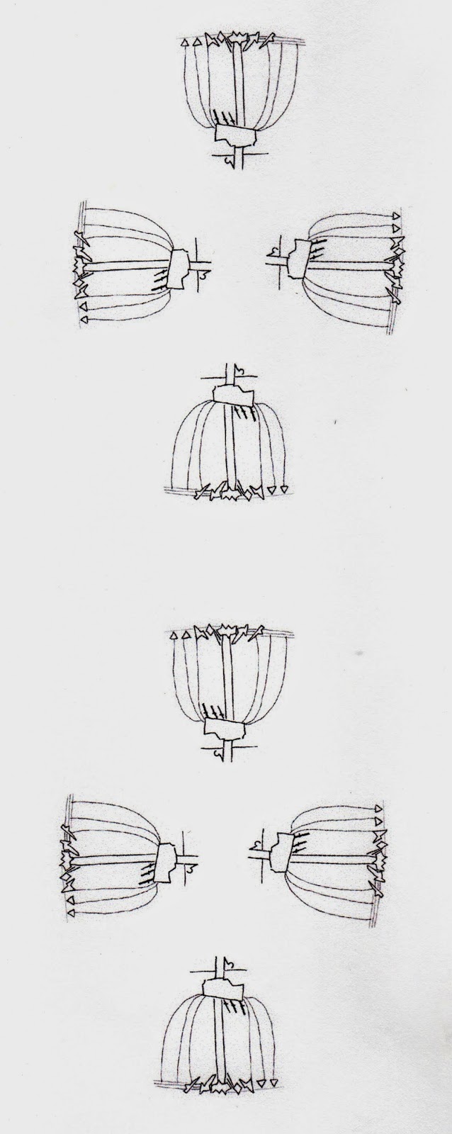 Still with Lucienne Day this caught my eye: 
It is the original artwork for the "Riga" design of 1961. It shows coloured paper pasted onto mono printed background. Heal's eventually sold this design at 12s 9d in several colourways. I had a try at my own version:

I sponged the background with black and white acrylic paint allowing the colours to gradually mix. I think I was a bit heavy handed; it looks rather dark and busy and detracts from the stripes. The strips of paper are various colours and textures. All of the single colour strips are cut from A4 paper.
*************************
A bit of a change now and I think I'm about to get political.
I've recently seen the National Theatre Live production of War Horse and if I'd been at home watching it on the TV I'd have left the room and found something else to do. This is testament to the power and quality of the production and the difficult emotions it evoked in me. My Grandfather, a lovely, mild mannered man was in the cavalry in WWI so it has great personal resonance.
I've also seen several programmes related to World War I on the TV. The latest was just the night after War Horse (rather unwise I know).
http://www.bbc.co.uk/iplayer/episode/p01tcxg0/The_Great_War_Interviews_Frank_Brent/#group=p01tbj6p
This was a series of interviews with war veterans who recounted their experiences with great honesty and sensitivity. One man said that when he found himself wounded and face down in the mud he was pleased that his sufferings were just about over.
Katie Morter was a civilian living in Manchester and she recounted getting the dreaded news that her husband had been killed in action. She couldn't bear to read the letter and had to go round to a neighbour to get her worst nightmare confirmed.
All this has left me very thoughtful and I'm firmly convinced that all aspiring and serving politicians should see such work regularly to remind them their decisions have a human cost.
As a consequence I've been investigating war poetry and art and I found the work of Christopher Richard Wynne Nevinson (1889-1946) who was a noted British war painter. Nevinson represented war as a rather mechanised event rather than using the romanticed style used by some of his contemporaries.
Nevinson was a staunch pacifist who joined the Red Cross and served in the Royal Army Medical Corps. Although he was invalided out of the service because he had rheumatic fever he later returned to the front as an official war artist.
Some of his work made very uncomfortable viewing during wartime and was only published after the armistice.
Between the wars Nevinson concentrated on townscapes but he once again became a war artist in the second World War although he had a stroke and was once more invalided out. He died in 1946.
Source: firstworldwar.com: http://www.firstworldwar.com/bio/nevinson_christopher.htm.
The hardness of the angles and the metallic helmets and guns reveal the full horror of what Nevinson saw. The faces show grim concentration and tremendous strain.
This is presented as a very ordinary town during extraordinary times. Houses are fragmented but it is possible to see what they were like before the bombing.
Because I like the busyness of it I took a snip of The Arrival. I chose my snip because I liked the shapes.
 I isolated the main shapes: 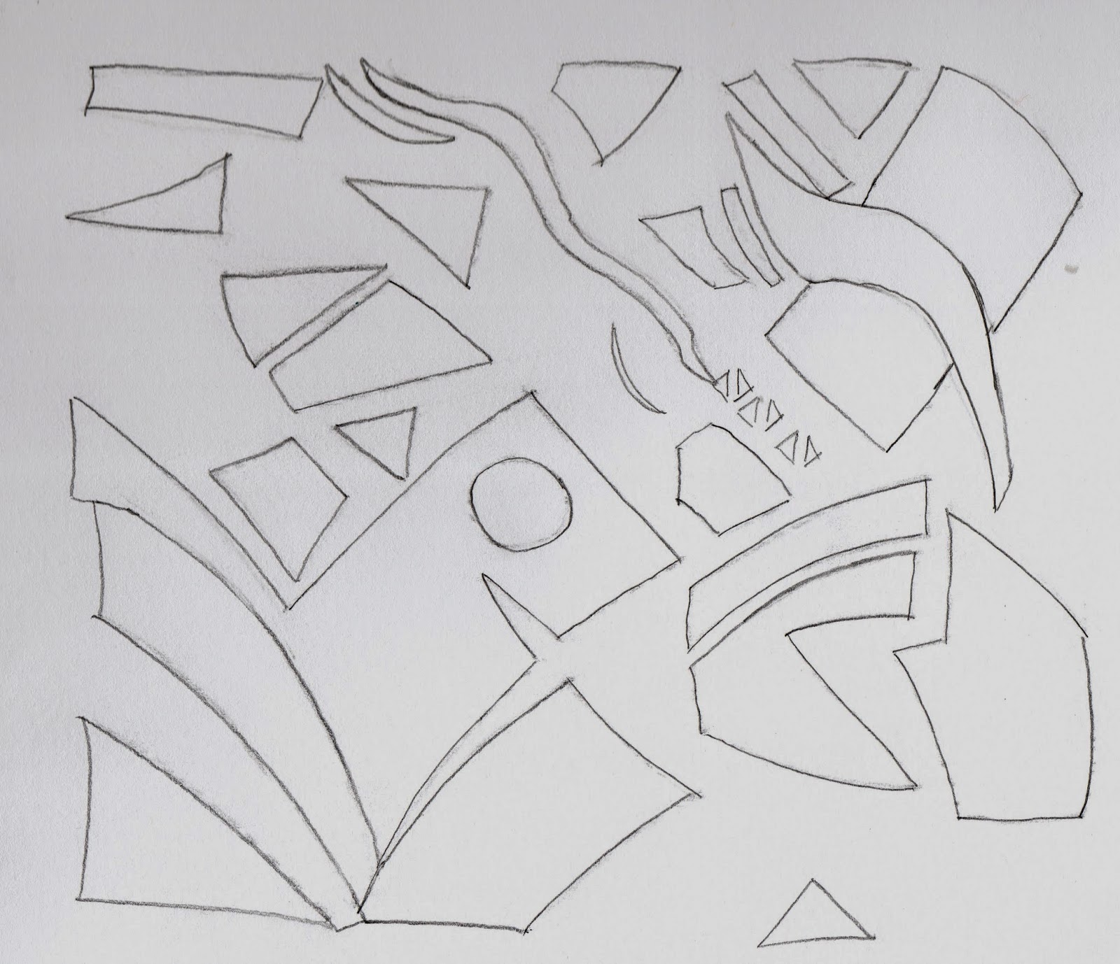 I think this still retains the energy of the original. However, I think there are parts that I'd really like to pull out and work with - the four triangles really appeal to me.  I turned these through 90 degrees to get a repeat pattern then I coloured them loosely using Nevinson's scheme.  I think this makes an interesting border but I continued to build it up into an all over pattern:  The individual images look a bit disparate and I think if they were closed up a bit it would look better.
**************************************
I spent the afternoon in Sherwood Forest and sadly didn't see Robin Hood. What I did see was lots of magnificent old trees in weird and wonderful poses. I think the Major Oak (allegedly one of Robin's hiding places) is eight hundred years old. This is a selection of the photos I took and I must emphasise that they really are all oldtrees!
    
Above is the Major Oak which is 800 years old and propped up.
Inside it is hollow.
  
Above - Looking up inside a hollow tree.
 
Some of these trees are definitely dead but I was surprised to see lovely fresh green leaves on some of them.
No two trees offered the same texture of bark and there's lots to think about.
I've managed to get some close up snips that I'm pleased with: 
This looks just like a arial map
   I took so many photos that I'll not be able to use them all so I did a collage using my computer. It's hard to think this is lots of images combined.  My head is spinning with ideas for these images - the trick is to sort out the best.
*************************
|


No comments:
Post a Comment