Sketchbooks and portfolio work
I have so much material it's hard to know where to start. However, during Part 4 I spent an afternoon in Sherwood Forest and some good images came out of that. They were mainly dead trees and some close up shots of shapes I used some in my Part 3 work. There were one or two that showed trees at a distance and a couple of those have caught my eye.
 |
| Sherwood Forest |
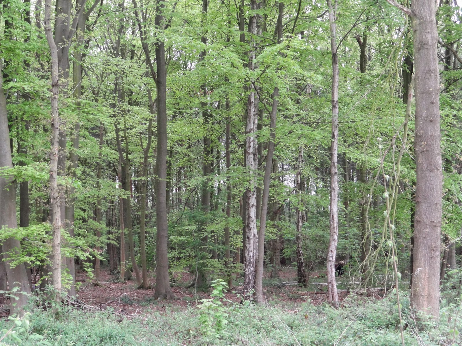
Although some of the trees aren't silver birch they all have the long thin trunks we associate with them. I'm reminded of the work I did earlier about stripes and also some of my first screen printing using masking tape:


I think with particular placement this technique could be used as a basis for tree trunks.
I've been looking at other portrayals of tree trunks at a distance, silver birch particularly and some are truly lovely.
David Hockney's love of trees is legendary:
David Hockney's love of trees is legendary:
 |
| David Hockney at the Royal Academy with his painting The Arrival of Spring in Woldgate www.thetimes.co.uk |
 http://www.dailymail.co.uk/ 15 February 2011
A different and very seasonal bluebell twist:
|

Silver Birch 7 by Jan Rippingham
theartonlinegallery.com
|
 |
| Autumnal silver birch 4 by Jan Rippingham theonlineartgallery.com |
 |
Frank Bowling RA Silver Birch, 1985
Acrylic on canvas 70 x 96 inches
http://rolloart.com/
|
Frank Bowling's work makes me think of an effect I can get on the computer:

This is my photograph using the emboss effect on Paint.net. Although it looks effective on the screen when I printed it - well lets say it just didn't work, it was just a mass of grey. I'm not sure whether I can digitally colour this but I'll have a try. (Alas, I didn't manage it, but as I become more proficient at the programme it may be possible.)
I'm sure the reason the image didn't print well is because it isn't actually in relief - a bit of twig collage and some papier mache might be the way to go.
There are lots of ways to be inspired by the beautiful silver birch tree markings
 Silver birch brocade highline dress Alexander Lewis www,avenue32.com |

Silver birch Galena trousers
Alexander Lewis
www.avenue32.com
Until you get close to silver birch you don't realise that they have so many dark marking on them and they are quite dirty:

I think the big danger with silver birch images is that they can pretty soon become bucolic.
I've been working in my sketchbook and I was going to stick in a large copy of the first image in this post. I turned it over to apply tape and the underside was just beautiful so I put tape on the front instead!

It's like being in a dream.
I've also had a first go at drawing using Paint.net with less impressive results:

I think this way to draw has great possibilities but I've a good way to go before I stop making lollipop trees.
I'm going to try a collograph working from the same image. I don't have any printing ink so I've made some 3x3 samples to see what will work best. I've used cut out shapes, cut into shapes, tile adhesive, sawdust and wood shavings to try to get a variety of textures. I've only done this once before and then I covered the plate with PVA so it could be cleaned. I have no printing inks so I'm not sure what medium I'll be using. I'll do two coats of PVA this time as well.
These are the results:
The final one was household emulsion paint which thankfully got lost in translation.
The best result by far was from the acrylic paint and that's what I planned to use. Geographically I'm not well placed to get things like printing ink but I happened to come across some Adigraf water based ink. My previous experience was with oil based ink so I didn't know what to expect and how to use it.
I made a plate using mounting card as my base and covered it in PVA back and front. I used cut card, textured wallpaper, tile adhesive and bits of net, scrim and cotton. The fabric was stuck on with household emulsion.
The ink came out of the tube rather thicker than toothpaste or tomato puree and wouldn't spread so I diluted it with some water to the consistency of double cream. In my other collograph experience the oil based ink needed to be wiped of and burnished before printing but when I tried this it just took all the ink away so I had to re apply it.
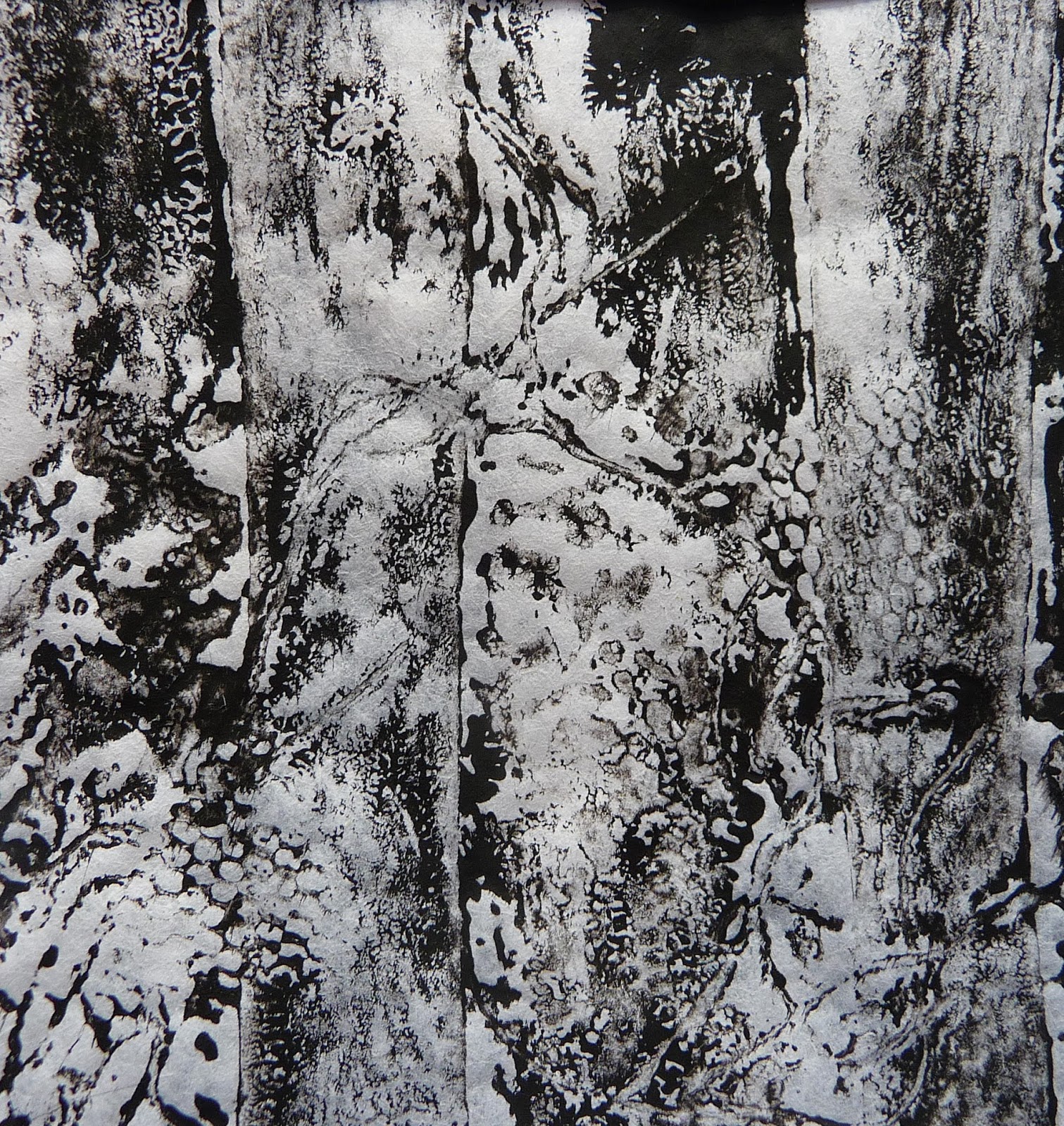
I have no press so my first print was done using just my hands to press the thick paper into the plate.
This is a very detailed print and some of the constituents are easily identifiable like the net and the strands of cotton. The woods look a complicated place, not light and airy.
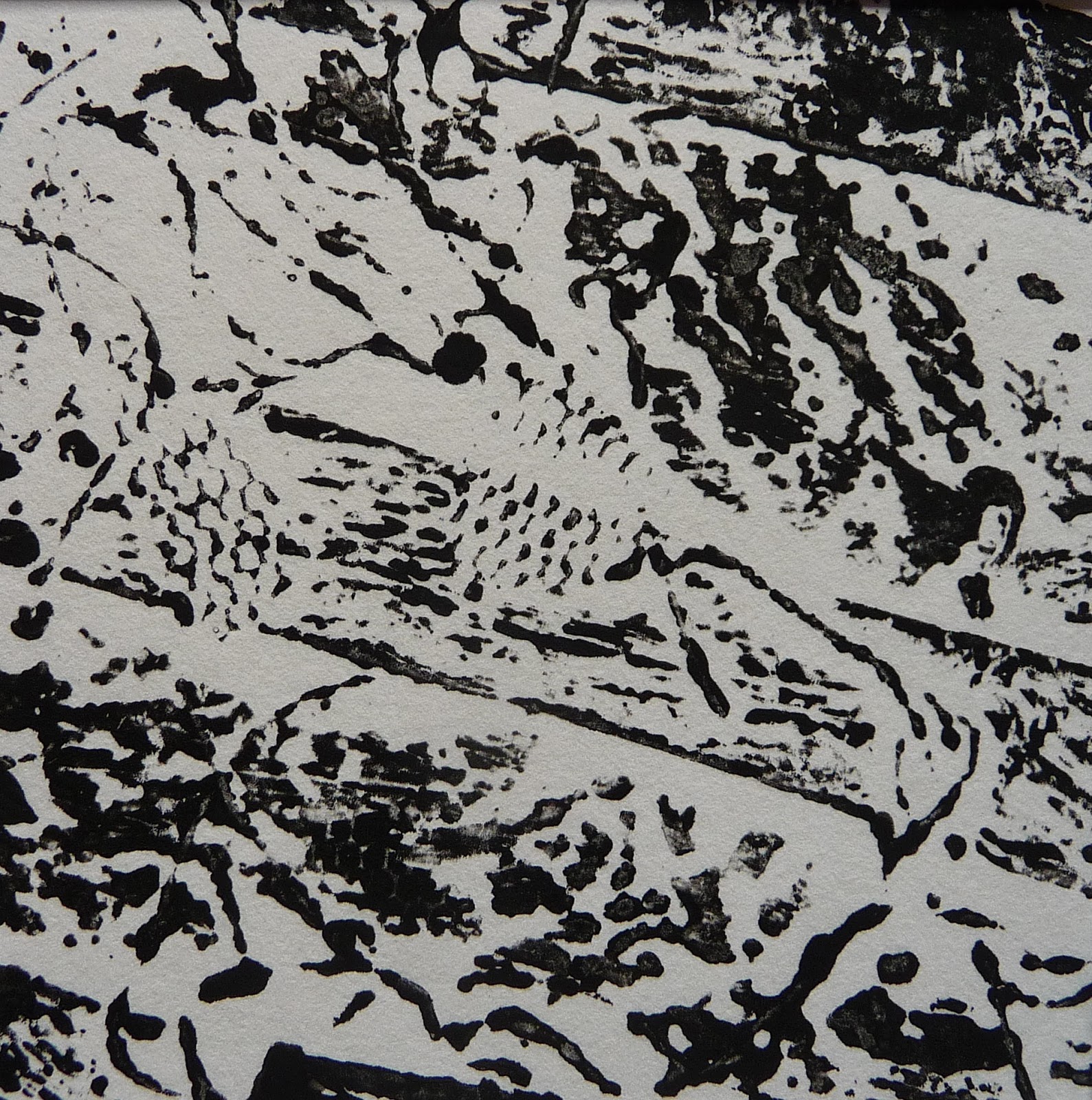
Without re inking I took another print and used my rolling pin:
This gave a very different look. The trees look more solid and the open space between the trees is more evident. This looks far more light and airy.
I re inked and used a combination of the two; hands first then the rolling pin:
This is the deep, dark forest with the real possibility of a Gruffalo, Ents and certainly a bear hunt. It is definitely nothing like the wood where I took the photo.
I hadn't any more decent paper to hand and some ink left on the plate so I grabbed a sheet of tissue that had protected some acetate sheets and the result was amazing;
This had the misty, dreaminess of the reverse image. There's lots of detail but little of the blackness evident previously. Maybe because it was such a surprise this is my favourite.
I didn't wash my plate because the PVA was starting to break down which was no great surprise as my ink was water based. This is how it looks after it's hard work:
I used my viewing frame and got some interesting images:
But best of all:
I like this because it captures the misty, dreamy quality that appeals to me. I feel unsure how to pursue this but I've found that letting things lie around for a while often helps the process.
In the meantime I thought I'd make a final use of my plate by doing a tissue paper collage hoping that some of the textures would come through. Except for the foil trees they didn't but nevertheless I think it's a good use for redundant plate.
Somehow the positive and negative get mixed up as I look at this work. This is much better viewed from a distance - the forest floor looks littered with flowers and the remains of the ink, whilst black seem not to make to dark and forbidding an image. Is it attractive, yes, ethereal, I think not.
I was reminded of my work using light as an aid to mood and wondered if I could do a collage on transparent plastic. I was thinking of stained glass and to that end I used the shape of a window pane as a basis. This, of course, changed the proportion of my image. I used aluminium foil that I embossed using a bumpy slate tile and I glued it onto the plastic sheet. I then used organza bits to go from a colourful forest floor to a pale sky. I put some darker net fragments into sky but it didn't work at all. I also included some climbing plants in the form of novelty wool - no, no, no. It would have been much better to have included further embossing maybe with some wire laid across the tile at the appropriate angles. Additionally, the more square shape was wrong; the image needs to be long and thin like the trees.
The colours got a bit lost against the window but on the table they were much better defined. I think I want to pursue this idea but I need to work some things out:
I think the big danger with silver birch images is that they can pretty soon become bucolic.
I've been working in my sketchbook and I was going to stick in a large copy of the first image in this post. I turned it over to apply tape and the underside was just beautiful so I put tape on the front instead!
It's like being in a dream.
I've also had a first go at drawing using Paint.net with less impressive results:
I think this way to draw has great possibilities but I've a good way to go before I stop making lollipop trees.
I'm going to try a collograph working from the same image. I don't have any printing ink so I've made some 3x3 samples to see what will work best. I've used cut out shapes, cut into shapes, tile adhesive, sawdust and wood shavings to try to get a variety of textures. I've only done this once before and then I covered the plate with PVA so it could be cleaned. I have no printing inks so I'm not sure what medium I'll be using. I'll do two coats of PVA this time as well.
 |
| Prior to PVA |
These are the results:
 |
| Acrylic paint gave the sharpest result |
 |
| Selecticine fabric dye with thickener didn't pick up the shapes at all |
 |
| PVA and procion dye just pulled when I lifted the plate |
The final one was household emulsion paint which thankfully got lost in translation.
The best result by far was from the acrylic paint and that's what I planned to use. Geographically I'm not well placed to get things like printing ink but I happened to come across some Adigraf water based ink. My previous experience was with oil based ink so I didn't know what to expect and how to use it.
I made a plate using mounting card as my base and covered it in PVA back and front. I used cut card, textured wallpaper, tile adhesive and bits of net, scrim and cotton. The fabric was stuck on with household emulsion.
 |
| My plate |
The ink came out of the tube rather thicker than toothpaste or tomato puree and wouldn't spread so I diluted it with some water to the consistency of double cream. In my other collograph experience the oil based ink needed to be wiped of and burnished before printing but when I tried this it just took all the ink away so I had to re apply it.
I have no press so my first print was done using just my hands to press the thick paper into the plate.
 |
| Using my hands as a press (1) |
This is a very detailed print and some of the constituents are easily identifiable like the net and the strands of cotton. The woods look a complicated place, not light and airy.
Without re inking I took another print and used my rolling pin:
 |
| Using a rolling pin as a press (2) |
This gave a very different look. The trees look more solid and the open space between the trees is more evident. This looks far more light and airy.
I re inked and used a combination of the two; hands first then the rolling pin:
 |
| Hands and rolling pin as a press (3) |
This is the deep, dark forest with the real possibility of a Gruffalo, Ents and certainly a bear hunt. It is definitely nothing like the wood where I took the photo.
I hadn't any more decent paper to hand and some ink left on the plate so I grabbed a sheet of tissue that had protected some acetate sheets and the result was amazing;
 |
| My hands as a press on tissue paper (4) |
This had the misty, dreaminess of the reverse image. There's lots of detail but little of the blackness evident previously. Maybe because it was such a surprise this is my favourite.
I didn't wash my plate because the PVA was starting to break down which was no great surprise as my ink was water based. This is how it looks after it's hard work:
 |
| The well used plate |
I used my viewing frame and got some interesting images:
 |
| From print (1) |
 |
| From print (1) |
 |
| From print (2) |
I like this because it captures the misty, dreamy quality that appeals to me. I feel unsure how to pursue this but I've found that letting things lie around for a while often helps the process.
In the meantime I thought I'd make a final use of my plate by doing a tissue paper collage hoping that some of the textures would come through. Except for the foil trees they didn't but nevertheless I think it's a good use for redundant plate.
 |
| My plate covered with tissue and foil |
Somehow the positive and negative get mixed up as I look at this work. This is much better viewed from a distance - the forest floor looks littered with flowers and the remains of the ink, whilst black seem not to make to dark and forbidding an image. Is it attractive, yes, ethereal, I think not.
I was reminded of my work using light as an aid to mood and wondered if I could do a collage on transparent plastic. I was thinking of stained glass and to that end I used the shape of a window pane as a basis. This, of course, changed the proportion of my image. I used aluminium foil that I embossed using a bumpy slate tile and I glued it onto the plastic sheet. I then used organza bits to go from a colourful forest floor to a pale sky. I put some darker net fragments into sky but it didn't work at all. I also included some climbing plants in the form of novelty wool - no, no, no. It would have been much better to have included further embossing maybe with some wire laid across the tile at the appropriate angles. Additionally, the more square shape was wrong; the image needs to be long and thin like the trees.
 |
| Organza and foil on transparent plastic held against a window |
 |
| Organza and foil on transparent plastic on a white table |
The colours got a bit lost against the window but on the table they were much better defined. I think I want to pursue this idea but I need to work some things out:
- how to keep the ethereal quality and have some depth of colour - look at how many layers work best
- what to stitch onto; can I just use organza or is it best to use lawn and then cut away unwanted fabric
- what to use for the trees; foil is too delicate to be stitched; maybe some thicker aluminium sheet
- how be to get the impression of creeping vines up the tree
- with a (probably) limited palette how to create texture
- this will probably be site specific so determine if not the size at least the proportion
It looks like sample time.
Well it did!
I became very frustrated messing about with Bondaweb and organza. My basic rule is that if I'm not enjoying what I do I stop and take stock. I've done just that and I'm going back to the drawing board. I plan to use the same basic image but forget about transparent. What a frustrating day.
There is so much mileage in tree images. You might consider bumping up the contrast of the embossed effect image. The detail might then be picked up better by the printer.
ReplyDelete