Friday, 15 November 2013

Angie Lewin


I found Angie Lewin on the internet and thought her work was lovely.


http://www.angielewin.co.uk/collections/my-work

It's worth a look and she's got an exhibition at the Yorkshire Sculpture Park starting tomorrow.

Part 2 Stage 3 (2)

Working with vilene


If you've read something like this before and it's not quite the same I'm sorry.  Stupidly I've just deleted the original and I'm now re-writing.  Because the work isn't fresh in my mind I doubt it will be in such detail as the missing post.

What I'm going to do is work around my photos and rely on my memory.

I looked on the internet for information on printing with a vilene screen and came across this site:

http://www.maggi21handdyes.com/printing-vilene-interfacing-screen/#comment-887

This gave good, straightforward instructions for working with vilene so I decided to try it out.

(Thanks Maggie for your interest and encouragement) 

I've become interested in the work of Soraya French (2013) who has written articles on Colour Triads in "The Artist".  As a result I decided to use the red, yellow, blue triad and see what happened.


I have so many colours here.  I used about half a square metre of calico and randomly printed.  First there were 3 pulls of red then 3 of blue and finally 4 of yellow (because there was a gap).

I'm pleased with this.

Next I tried the same method but made cut outs and painted acrylic paint on the vilene.


This time I used the orange, green, purple triad:


Once again the colours are quite spectacular and there's lots of texture.

Reluctant to put my gash paint down the sink I slopped it onto another piece of calico and hey presto

My serendipity cloth

Areas of interest can take you near and far

The safety of my garden

Down in the jungle where nobody goes


Space - the final frontier


Sorry if this is less than before but that's the gist of it.


French Soraya, 2013, The Artist.  Jan, Feb, Mar, Apr, May Journal

http://www.maggi21handdyes.com/printing-vilene-interfacing-screen/#comment-887

http://www.youtube.com/watch?v=bOv6-Mlv0Ls

Saturday, 9 November 2013

Part 2 Stage 1 (2)


Knowing that "man made" was coming up I've saved this just because I like it.  It isn't anything to do with grids and stripes but I want a play with it.

I'm not much of a techie but this component from a floor light is beautiful.  It has lots of bits all of which I'm sure have a purpose.  In life it has shiny, glittery parts but that's not very evident on the photo.


This circuit board is by no means flat but I wanted to take some sort of a print from it.  I used a heat sensitive foam to make a printing block (although the foam wasn't big enough for the whole thing):


I then sponged paint onto the foam and printed:


I tried once or twice and this is the clearest.  Because I was in a hurry (so the foam didn't loose its definition) I didn't clean off the paint between prints, hence the muddy colour.

The shape of the copper coil is the most appealing image:


I experimented with different colour combinations - some are better than others.


The only thing that's different in the next two images is the background.
See how the colours seem to alter.

This resembles a night sky

Not enough contrast

This looks like something from nature

Because there is a wreath look to this and Christmas is on the way I made a corny image by putting in some holly berries.

Corny Christmas


It was interesting also to look at the shapes on the foam more closely:


This one was deep and full of character but on the print it only showed as a splodge.


Part 2 Stage 3 (1)

Printing techniques

Of all the things I've tried this once scares me most perhaps because it's a leap into the unknown.  I've read lots and found conflicting information.  I've been confused about what ink/paint to use and in the end I've bought Selectacine from George Weil.  This is a combination of a binder (SF20) and a pigment that should "provide a soft finish (with) outstanding colour fastness".  The colours I was warned "are highly concentrated".  This didn't make me feel any more confident but in the end decided to just do it.  

I taped up my aluminium frame and prepared my work space (all to delay the inevitable).

I decided to try on paper first

I used masking tape on the top of the screen.  I decided to use my grid idea again but really I just wanted to see how much medium, what proportion of binder to pigment was needed and how the technique actually worked.


The first print

In the photo this looks pretty even but in reality there's too much paint and it looks bubbly.  I did a second and then a third pull in order to cover the space.

I used 3 teaspoons of binder and 1 drop of pillar box pigment which was enough.

To what was left I added another 3 teaspoons of binder and a drop of aquamarine.  I didn't clean the screen because I wanted to see what a mix of colours did.  I pressed harder with the squeegee and still I didn't cover the whole surface and should have done another pull.


The top is on the left o the pull was from left to right

The bubbly effect
...and again, it's quite pretty if that's what you want

I'm not sure what's happening here.  It might be to much paint then when the screen lifts the excess is pulled up.

I tried again with less paint.  In fact I just added a drop of white to what I had left.


I tried to control the angle of the squeegee so that it used the tip of the blade more effectively but once again it seemed to run out of steam towards the end of the pull.  And I still got bubbles.

I'm sure that using paper is partly the problem and the paint is thick and not absorbed as it would be by fabric.  In addition my paper was probably too large for a first attempt (A3). 

Using calico

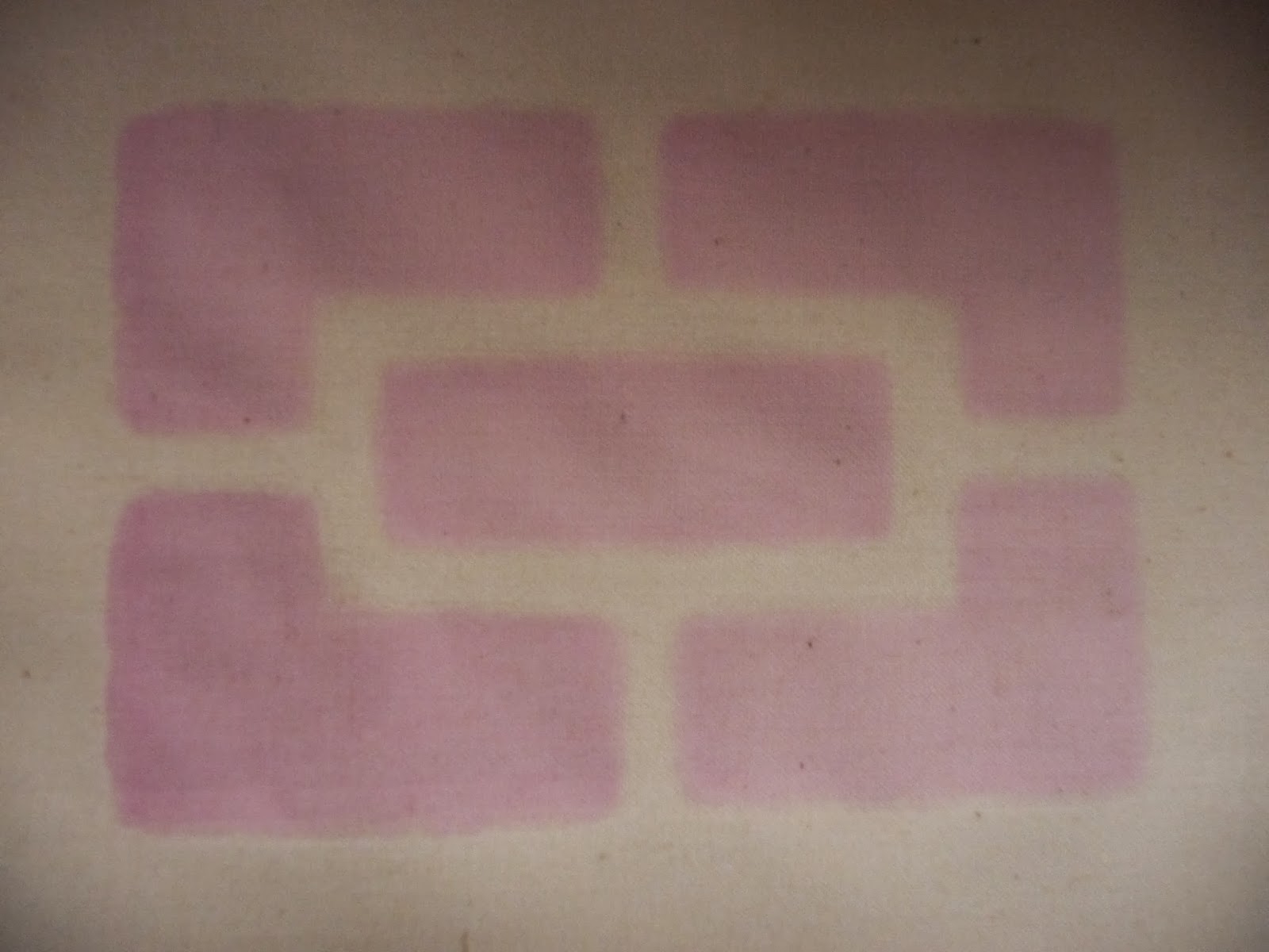
I'm reducing the size of my printing surface and using a sticky plastic stencil to print on calico. I cut a simple design of squares.


I wanted to print starting with a pale blue then move the frame and overprint with a darker shade.  I felt that was the most economical way of using my materials.  I found that the paint left on the mesh provided an unexpected bonus.


I printed with light blue and then a darker one

I printed with pale blue and got a shadow from the mesh

Light blue, dark blue and shadow from the mesh


The excess that occurred on paper wasn't evident on the fabric thank goodness.  Registration is something I've got to get to grips with.  I'm using minute quantities of pigment on these one off pieces of work.  It would be hard to replicate the exact colour.

As this work dried I noticed that the water content of the paint had bled and taken a shadow of pigment with it.  It was OK when the stencil came off so I'm not sure what happened.

This happened again with my next attempt, again with sticky back plastic, but the marks weren't as obvious because the pink was so pale.  The pink was made using my binder and some batik dye whose provenance I'm unsure of.  It was by no means as concentrated as the Selectacine.  I dried the fabric then printed again with a green that is far too harsh.  I'm on a steep learning curve all round even with the intensity of the colours I'm using.


The green bled as well and I'm at a real loss as to how to correct it.  With my next sample I'm going to try some other material and see if that makes any difference.


The green motif is slightly smaller than the pink one and it looks very prominent with it's pale partner.


A thing I'm going to have to resolve is the difficulty of lining things up properly.  To this end I've ordered some hinges and I'm going to make a dedicated board otherwise I'm going to be tearing my hair out.

Whilst I await my hinges I'll continue to play around with technique.  I used some poly cotton to print with torn masking tape and it hasn't bled at all.  I used the green left from my last piece of work but made it much softer.  I once again used the grid idea but made the lines an irregular shape. Unfortunately I forgot to tape the fabric down and ended up in a mess when I lifted the screen and had to peel it off.


I had another go with some red.  I cleaned nothing because my screen wouldn't wait and I got a barely perceptible green tinge to the edge of the red.


I let it dry and taped up my screen again this time horizontally (pic is presented in landscape)


This is the strangest effect; it could almost induce vertigo.  The blue jumps out and the red and cream seem to wriggle.


The green background doesn't work in the same way and I'm not sure why.  Maybe it's something to do with the colours having less contrast.

As these dried I started to see them differently.  Instead of seeing the blue very definitely laid over the green/white I began to see the blue as the background with green/white superimposed.  It was the same with the red and blue piece.  It reminded me of the optical effects of positive/negative.

Crone or beautiful woman?

I had some green paint left so I tried on some silk.  I was so disappointed with it I didn't even take a photo.  A couple of days later I had some paint left over so I masked up my screen, this time on the diagonal, and gave it another go:

The green is vertical and the purple is on the diagonal

I have learnt not to write mistakes off too quickly.  This is now quite presentable and offers its own optical effects.

Technically I have a few difficulties the main one being I end up with too much paint at the top and by the time I reach the bottom I'm running out. I have resorted to all sorts of tactics that no tutor would approve of.

I have looked locally but there are no day courses otherwise I'd do one and get sorted out.

Having said all that I've come a fair distance in a short time and if I can get over the mess I might even enjoy it.


Kinnersley-Taylor, 2003,  Dyeing and screen printing on textiles. A & C Black. London
Stromquist, 2004, Simple screen printing. Lark Books New York


Saturday, 2 November 2013

Part 2 Stage 1 (1)

Sketchbook work

After a fairly unsatisfactory foray into using an A4 sketchbook I 'm going back to an A3 size where I've realised I'm far more comfortable.  I bought several from Two Rivers at Frogmore when I was at Patchings Art Festival and this is my last one.

The topic "Man made environment" has made me think about what is natural and what is man made. It seems to me that all things have a natural origin and man modifies in very many ways. 

"Man made" has connotations of something inferior or synthetic but in fact it is a sign of development, initiative and the creative use of natural resources.  The wonderful bridge at Ironbridge or the inlay work which is such a feature of the Taj Mahal are man made from naturally occurring materials and very beautiful.

Ironbridge

Marble inlaid with slices of semi precious stones 

In the summer I visited  Masson Mill in Matlock and I found a strange sort of beauty of the industrial kind.

Masson Mill

I'm going to focus on lines and grids and to do sketches that may eventually find their way into my screen printing work.

This image is taken at the Yorkshire Sculpture Park.


The tantalising glimpse through the window is almost obscured by the grid of the window with its heavy surrounding frame.  I used Paint.net to manipulate the image.


The Dents effect at the default setting

I isolated a scary Halloween image


I flooded the window frame with green and the smaller panes picked it up as well. (I find Paint.net a bit unpredictable).  I put in touches of blue and suddenly the whole thing looks 3D.  It is a much gentler image than the original because of the pastel colour.


This one took the same starting point but coloured the inside of the panes rather than the frame. I used several blue tones.  What appears to be yellow is a tiny bit of the original background showing through.  The colours are flat but the many lines make it interesting and textural. It is more robust than the one above and far more exciting.
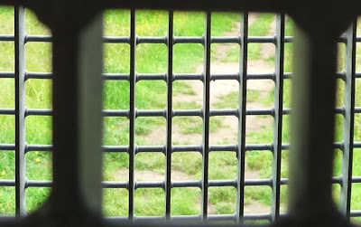

I isolated one pane


I took the idea of the grid and did a print on paper from a piece of glass.


I put some yellow acrylic paint onto glass and daubed on some green.  I put yellow paper over it and used a 4cm roller to make grid type marks.  The result was not impressive - far too much yellow and not enough blue.


The second print was on blue paper and looks much better - it gave the same feeling of an ethereal vista as my photo.  The grid lines from the roller are double and sometimes triple as I've repeated the rolling.


The idea of lines and what to do with them appeals to me so I thought I'd cut myself some bits of card and just play awhile.

A bit of corrugated card 10 x 6 cm

 I dipped the card into paint and as I finished with a colour I snipped off the end.


Red in a regular grid and orange in a staggered grid at 45 degrees

There are some interesting shapes emerging from the intersections.


I drew the above image and made a repeat pattern out of it.  It forms stripes in two directions.


More muted colours

The colour combination here is really subdued and I find it quite uninteresting.  The mixing of complementary and harmonious colours is something I need to look at further.  There is more interest if I zoom in.


The pattern of the corrugated card shows up well and adds to the texture of the image.


Quick, close together print that looks like ripples on sand.

This is very busy with lots of texture.  I think it looks like ripples on sand.


These are just the colours I had left on my palate.  I dipped the card in and did a twisted line print then kept repeating without snipping my card.  This gives a very varied array of colours that is surprisingly attractive in its combinations.


I looked online at "lines" and was amazed to find how many ways they could be presented.

httpwww.graphicxtras.comphotoshop-patternsgrid-gallery-patterns-112.png


These are some of my favourites  :

httpwww.graphicxtras.comphotoshop-patternsgrid-patterns-photoshop.htm
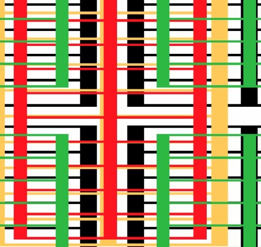
The beginning and end of these lines are almost imperceptible.  They vary in width, direction and colour and the white background seems far in the distance.
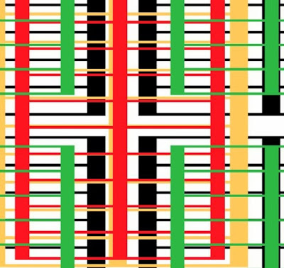
httpwww.graphicxtras.comphotoshop-patternsgrid-patterns-photoshop.htmmm

These seem much less complicated, they are easily understood.  It reminds me of the wall bars in a school gym.  There is depth to this image and I think that is to do with the under and over presentation.


Not entirely linear
httpwww.graphicxtras.comphotoshop-patternsgrid-patterns-photoshop.htmdot grid


This too is grids and lines but quite different.  It is layer upon layer of spots of varying sizes.

Although grids, stripes and checks are a fact of everyday life I thought it might be interesting to see how the dictionary defines them.

Grid
A framework of crisscrossed or parallel bars
http://www.thefreedictionary.com/grid

Stripes
A long narrow band distinguished, as by color or texture, from the surrounding material or surface.
A textile pattern of parallel bands or lines on a contrasting background

fabric woven of differently colored yarns in a cross-barred pattern

Plaid

A plaid is a pattern consisting of crossed horizontal and vertical bands in two or more colours in woven cloth.
Common examples of plaid patterns include:
  • Tartan, the pattern most commonly associated with plaid.
  • Gingham and Border tartan, featuring bands of equal widths in a simple pattern similar to Check (pattern).
  • Tattersall (cloth), featuring very wide bands alternating with very narrow bands of contrasting colors.
  • Madras (cloth), a lightweight cotton fabric, typically with patterned texture and plaid design, also known as "Madrasi checks". 
          http://en.wikipedia.org/wiki/Plaid_(pattern)

I took the idea of stripes, limited my colour range to red and black (very uncompromising) and had a play.


Stripes of all sorts

The top three rows are in soft pastel.  I found I liked the broken way the pastel hit the paper.  Even the stripes with no white designed in, show white, like the broad red stripe on the second row.  
The bottom row is oil pastel  and although it offers the same broken white it is much more dense.  I like the fine checked design, it does strange things to the eyes.

The limited colour range seems to make me think a bit more about the form.

I have become very alive to the amount of stripes that surround me in my home - not always in fabric.  There are doors, floorboards, radiators and lots of other things.  One of the stripes I'm most fond of is a blind. The fabric is vegetable silk that I bought in Morocco.  


Vegetable silk blind showing the lustre and the variety of the stripes


Some of the stripes are chenille


Vegetable silk is made from the agave plant and the following link gives some good clear information.


I decided to try some more stripes of my own.

Newsprint on fabric
I coloured some newsprint and tore it into strips.  I laid it horizontally on some vertically striped linen.  I wasn't impressed enough to pursue the idea but I liked the way the red and blue made way for the other colours.


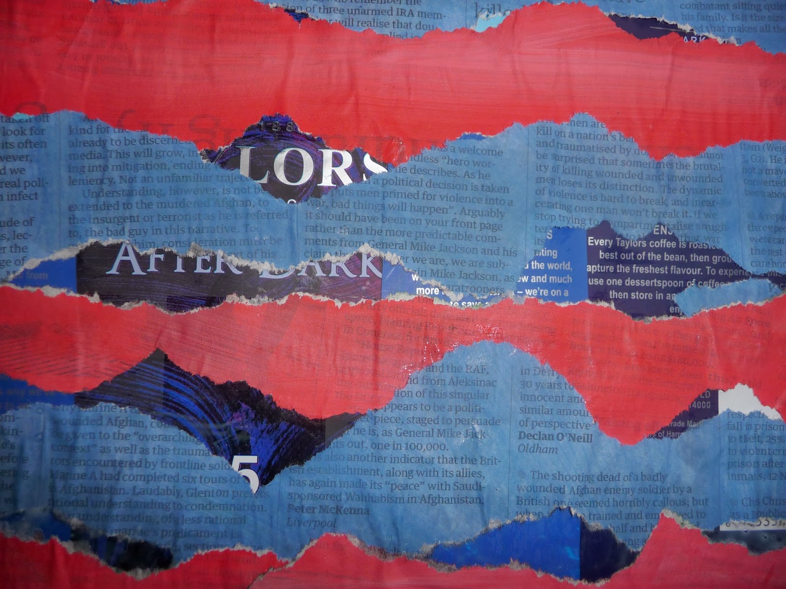
I had a couple of empty coffee packets so I cut them up to make a background.  I used the painted and torn newspaper and pasted it onto the shiny surface in a random way.  I like the fact that the newsprint and the bag both have stripes of print on them and there is a just discernible bar code. There's rough texture from the jagged newspaper and glimpses of a very smooth, shiny background. The words "After Dark" can be seen and the collage really does have a feeling of night time.

I played with the image in Paint.net:

Crystalise @ 45 cell size
 This breaks the image into crystals but the original image is still very pronounced.

Crystalise @ 211 cell size
With a larger cell size the image becomes a bit like a quilt with the shapes very mingled.  Whilst the colours in the original don't look blended there is a good degree of blending here.  The stripe is only just there.

Dents
 In this presentation the stripe is very much there and the colour blending not very obvious.

Ink sketch
Here the colour is very pale on the newsprint and much darker on the background - there's much more contrast.

Tile reflection

This reminds me very much of looking out of the window at the YSP that I used earlier in Part 2.  It has the same feeling of "looking through" at you don't know what.

Outline
This is my favourite.  All the original colour has gone but what has appeared is lots of stripy print and a vista of sky and mountains.

As well as computer manipulation there's always a pair of scissors.

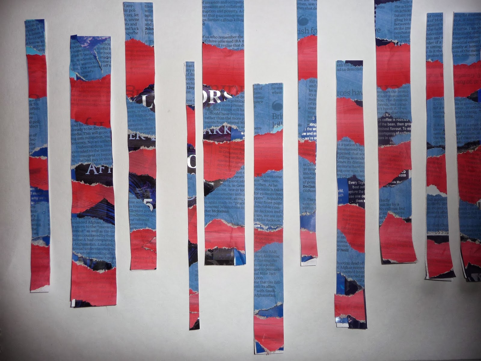
Cut into strips of various widths

It becomes stripes with a contrasting background


A variety of angles

Staggered heights

I imagine these lines crossing at some point

I know that often less is more but it seems that the more fiddling I do the better I like it.

Just a quick check to see what another background would look like:

Against newsprint - OK until the colour gets involved

Too confusing with the print and little by way of negative shapes

Finally I stuck it down

Multi coloured stripes created in Word


These remind me a bit of Paul Smith stripes now they are done although I think he has some white amongst the colour.  It is very flat colour and just begs to be played with in Paint.net.

Three lots of  Twist

Dents

Tile reflection makes a good repeat pattern