Showing posts with label Coursework. Show all posts

Wednesday, 4 June 2014

Part 5 Personal Project Stage 6


This post will detail the final piece of practical work for Exploring Ideas.  I had intended to make my work into a wall/window hanging but whilst playing around with the effect of light on my work I have found an opportunity to push a bit further.  The picture shows my sample wrapped around a circular glass vase and illuminated from within using an electronic tea light.


My work lit from inside the vase.
It looks very effective and would probably be more so with a small set of LED's that spread the light a little more.  I can see that the undergrowth needs to be higher; probably about one third of the way up the vase.

I set about making more tree trunks; dying more fabric, painting my bondaweb and tearing fabric into strips. While I was tearing scrim I thought how much like undergrowth it looked so I tried it out on some white acrylic felt using some left over tree trunks just to see what it looked like.

I tried two methods - in the first one I laid torn scrim fairly randomly at the base of the trees:

Scrim pinned to acrylic felt

The effect was interesting and certainly ethereal but it didn't look as effective as my stitches.
I tried another way.  I cut a long strip of scrim, gathered it along the bottom and anchored it down at regular intervals.  I slashed and frayed the fabric and got  a quite different look but once again I preferred the movement of my stitching.


 Gathered and anchored scrim 

 I then slashed and frayed scrim with left over tree trunk
Although I would dye scrim in grey colours I feel much more inclined to retain my straight stitches because there's texture and movement in them.

I've ordered some more Merino tops so now I'm just waiting. In the meantime I can get some measurements.

My vase is a cylinder with a 32 cm circumference and it is 25.5 cm tall.  I plan to allow a 4 cm seam which might seem a lot but I prefer to err on the side of caution. Experience tells me that I will need to start with a piece of felt 32 x 44 cm to allow for shrinkage.  I think I will dry felt the seam.  The alternative would be to try to put a tree trunk over the edge but I think that might be really awkward when it comes to stitching it.  I could of course just make a hand stitched seam.  I feel that I don't need to decided now.

The proportions might need to change just a little - I will probably have to use five tree trunks but I will play it by ear when I've made the felt.

When my felt came it was a slightly different colour to my sample - slightly more yellow and my tree trunks are slightly darker.

I followed the same methods as previously so instead of repeating myself this is what happened:

Creating texture with throwsters waste
(against a window)

Creating undergrowth texture with throwsters waste
(against a window)

Creating sky texture with throwsters waste
(against a window)

Testing the felt round the vase
I found that placement of the trunks was vital
 - you need to see three
After much deliberation I stitched six trunks onto my felt

I turned under the uneven edge on the bottom but wanted the irregularity at the top.  The top was higher than the vase but supported by it.  I looked at taking a portion off the bottom but that would mean losing some of the lovely silk undergrowth.  Taking the stitches higher spoilt the long thin look of the trees so they remained low.

Detail of my finished work showing
silk and stitched undergrowth

Detail of my finished work showing
silk and stitched undergrowth

My finished work - in daylight, gently lit

The best way to view this work is in the dark when it is lit from inside.


This is very effective and ticks all boxes I wanted it to.  It's surprising how much light comes through what is essentially wool.

Part 5 Personal Project Stage 5a


It's been pretty hard going at times but eventually it seems to be coming together. Doing a storyboard made me focus clearly on my selections and suddenly life became easier.

I made my felt and cut my tree trunks. I looked carefully at my birch bark markings:

Birch bark markings

I stitched my tree trunks to my felt using irregular straight stitches and three strands of dark grey embroidery thread.


This accomplished I used straight stitches again to represent undergrowth.  This time the colours I used were greys, black (one, two and three strands) and a very little silver (fly stitch).

Straight stitch undergrowth

I've restrained myself from putting too  much in as I think it would spoil it.  I have found that my work has several characters.  The first is demonstrated when it is put against a window. The silk becomes fluffy clouds and the trunks show their constituent fabrics:

Against the window in sunlight


When I lay it on my white table it looks completely different, it's not better, just different:

On my white worktable


Actually the best image seems to be a scanned one:

A scanned image


Because it looks good with light behind it I tried it wrapped around a clear glass vase with an electronic tea light inside:

Lit from inside a vase


Because this looks good I plan to do another piece of work that is made to fit this vase.  I think the undergrowth needs to be higher and I might investigate another idea I've had for undergrowth.  The tree trunks look OK.

I'm very pleased with this work.  It retains the mystery and the essence of the original photo in a very simple, pared down way.  The background felt is subtle and adds a lustre and sheen that have the ethereal quality I set out to achieve.

As sometimes happens in my web wanderings I found the website of Mary-Clare Buckle almost by accident. She creates what she calls "art lights".  These developed from her idea of "floating felt"  The development of these lights is detailed on her website at 

http://www.1-art-1.com/textile-art-light-gallery.html

and is very interesting.  Buckle talks about the way the light source "brings up the pattern of the individual wool fibres".  She also notes that the work looks very different but still attractive with the light turned off. This is just what I have found.

An art light in situ Mary-Clare Buckle
http://www.1-art-1.com/interior-design-art-lights-lighting-ideas-uk.html

Interestingly one of Buckle's developments is to enclose felt between acrylic sheets and then use light.  The website is well worth a look. 

Part 5 Personal Project Stage 4

My story board

When I settled down to do this I found I had to be quite specific about what I was going to use otherwise the board was overcrowded which would make it useless.  I found it a useful exercise because otherwise I would have been choosing entirely on the hoof and not getting good samples.


My collograph image is at the beginning followed by my merino tops and throwsters waste. Next are the materials I selected for my tree trunks and the threads I wanted to use (very plain).  I put in a piece of tree bark because it is so central to my thinking then a small sample of undergrowth.  The result was added later and is at the end of the "story".


Friday, 23 May 2014

Part 5 Personal Project Stage 3


After the frustrations of the last few days I've decided to put my window idea to one side.  I've learnt that fighting an idea is very different to being challenged by one.

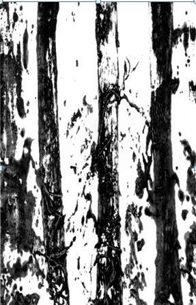
I'm going to take one of the simpler collograph images and make a black and white (and tones) image with paper.  My starting point is this and I'm still looking for a bit of mystery:


My starting point

I started by laying strips of torn newspaper vertically in my sketchbook (A3).  I painted some bondaweb grey but felt it was too wet so I put a tissue  on to soak up some of the excess moisture.  It looked lovely and fitted what I wanted to show:

Tissue with excess paint
I split the 3 ply tissue into separate layers and put them over the newspaper.  I continued to introduce new materials - the painted bondaweb torn into strips and laid horizontally and vertically, white organza on the bondaweb, some thin polystyrene that went shiny when melted.  The only thing I came to regret was the black material (explained later).


Part of my finished work - the tissue worked well at creating mystery

I thought this might back a good background on fabric so I printed it on bondaweb and put it on some white cotton.  I feel pretty resistant to working on white but I needed to try it out. This is the result:


This shows the colour change
even green on the unwanted dark shape

It printed in a sort of sepia which certainly isn't what I wanted.  I changed some of the colour settings but it was no better.  I found the central black shape didn't fit the background function very well - it was far too prominent.

As I cast around for suitable materials to try I raided the thin outer layer of the silver birch in the garden.  It cleaned up well with baby wipes and transferred to fabric using the ever present bondaweb:


It seems that if I want to use monochrome I'll have to apply paint directly onto my fabric in some way.

Something happened in my head overnight because I'm going to try some felting with some inclusions.

If I'm felting my first port of call is always The Art of Felt by Francoise Tellier Loumagne (2008).  In this book there's some background information about the felting process but the main reason I look at it is for inspiration.  The theme of her pieces is the changing sky and she explores the ways that it can be represented in felt.  She gives illustrations of how an effect is achieved.  This is called The Oncoming Storm:


The Oncoming Storm
Francoise  Loumagne


Using black mesh as a base, tuft with black wool fibre


Repeat with a paler shade of wool


Use a sewing machine to embroider swirling lines, adding detail to the design and making it more dense.


This one is called Bright spell and it is done using lightly gathered, printed net that is needle felted from both sides:

Bright spell - Francoise Tellier Loumagne

The whole book is full to bursting with such gems so suitably inspired I gathered together some materials in the right colours and with lots of textures.


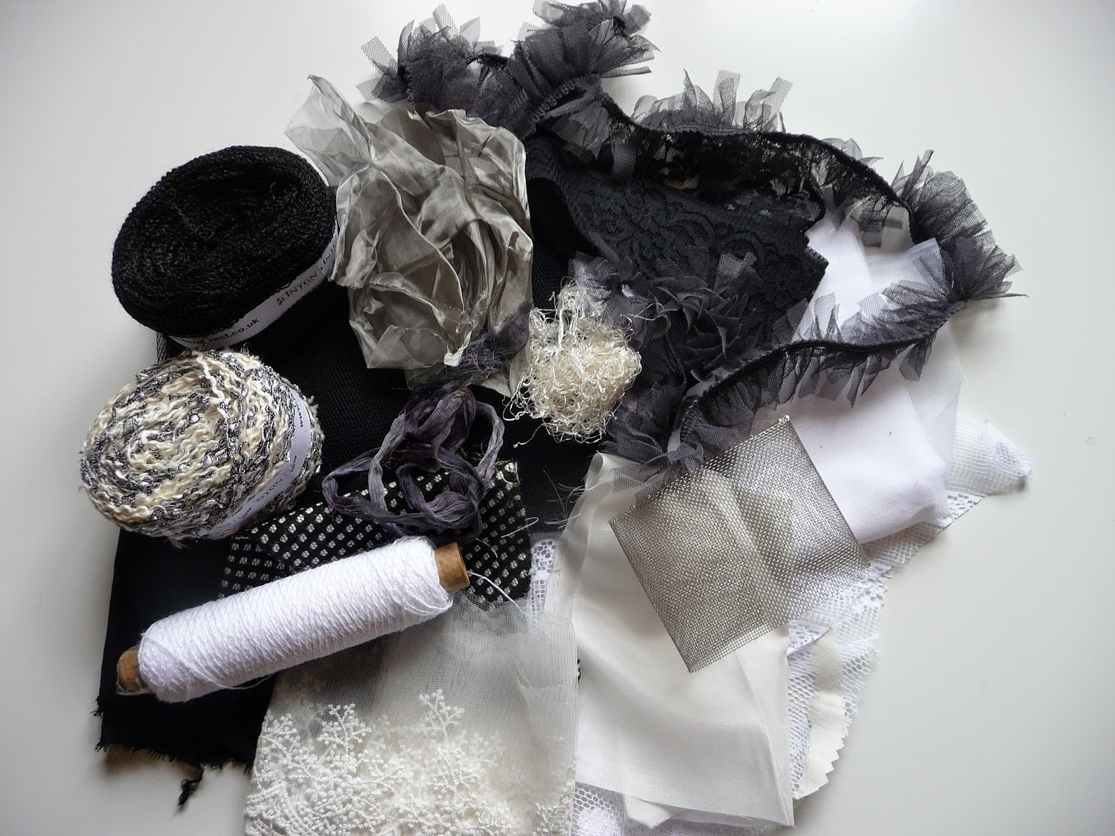
Yarns, fine steel mesh, lace, net, silk, throwsters waste to choose from.

I did the same with my tops (the darker of these is some Herdwick fleece I was given and it is pretty rough).  The stripy one is quite silky. :


I wanted to see if including wire would make a fabric I could manipulate so I knitted a small piece of wire mesh:


I wanted my felt to be quite soft and textural, there is no need for it to be robust.  Between the second and third layers I put a variety of my materials simply to see how they performed.


Net curtain - probably the most successful

Black yarn
A black, crinkly yarn


My knitted wire - it wasn't strong enough to hold a shape
but gave a good texture


Grey net, one, two and three layers thick - worked well


It seems as though it's possible to get good colour variations with inclusions and without being too heavy handed with dark merino tops which I find are fairly unpredictable.

Here's the great irony:  all these photos were taken with the felt held to the window!  Laid flat on the table it all looked very, very bland.  Perhaps the inclusions that need to be prominent would be best laid on the top of the wool.


Laid flat the felt looks very bland


Maybe I'll get my window piece after all!

Tellier-Loumagne (2008) inspires experimentation so I tried dry felting into some commercial mesh:


My mesh


Dry felting both front.....

...and back
I like the way the wire shows a little but it still doesn't hold it's shape.  I don't think this is very important right now but it's valuable knowledge.

I tried the same thing with net curtain as my base and it was possible to follow a shape very closely.


I've been working on how to interpret the tree trunks.  I painted three pieces of  bondaweb, a white, a grey and a black and I tore them into smaller fragments and placed them at random on organza.

Painted bondaweb on organza

It looked promising so I tried it on four different backgrounds

Black silk

Black net

Fine steel mesh

White silk


The photos don't show these samples very well because they look quite delicate but the silk and the steel are quite lovely although for my purposes the white silk works best.


I've returned to the collograph image I used earlier in this post and I've changed the proportions to better reflect the long thin nature of the tree trunks.  I used Word to do this and it will form the basis of my design.  I'm going to play with one, two or three trunks and pick and choose the shapes around them.


The basis of my design

Meantime I've dyed some of my white materials black.

I've been on a bit of a roll today (at last).  I've made some lighter weight felt and included only white throwsters waste - in quantity - and it's turned out well.  It has all the qualities I'm looking for.  It's a bit mysterious, ethereal and quite calm.  Against the window it looks lovely.

My silky felt

I used my fabrics to create a collage that I plan to cut up and use as my tree trunks.

The start of my monochrome  collage
I added strips of painted bondaweb and then put one layer of organza on top and the effect has the feeling I want.

With painted bondaweb and organza

Each tree trunk will be inevitably different.  I'll cut into the fabric tomorrow.


Tellier-Loumagne, F.  (2008)  The Art of Felt.  Thames and Hudson