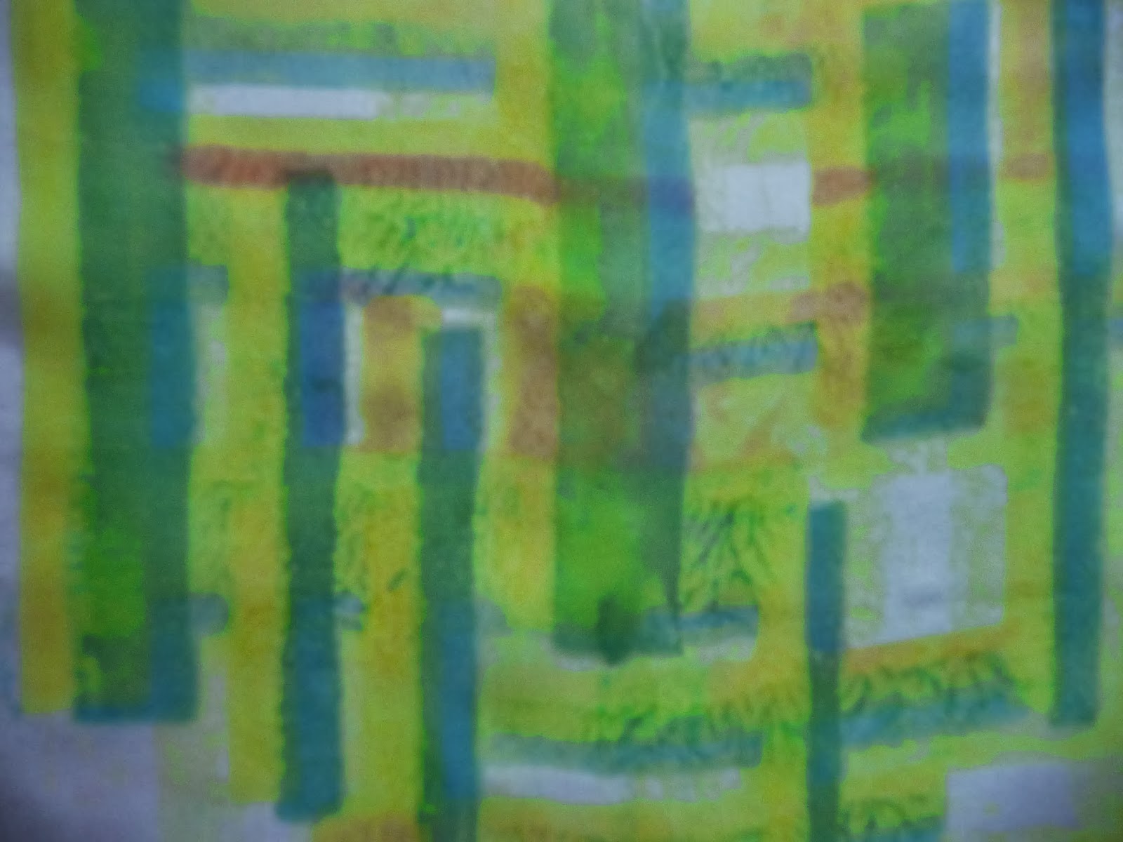
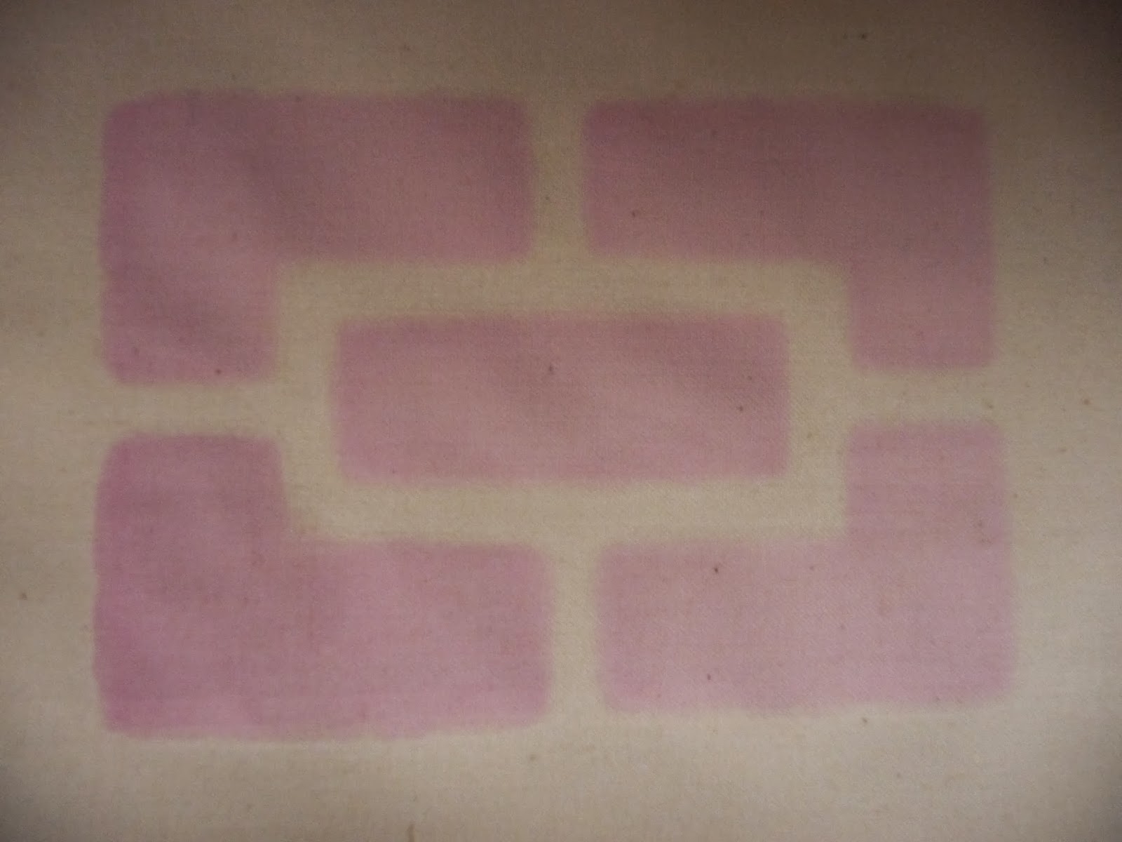
Showing posts with label Screen printing. Show all posts

Saturday, 30 November 2013

Part 2 Screen printing reflections

I have written these thoughts as they have occurred to me.  This has been such a new, busy experience that I didn't want to get to the end of Part 2 and find I'd forgotten things.

I began Part 2 from the very, very basics.  I knew nothing of the screen printing process and it took me ages to decide what sort of ink/paint to buy. I was very apprehensive.

I chose Selectacine dyes from George Weil but then bought some Procion.  This offered two different ways of working. The Selectacine sits on the fabric and the Procion goes into it.

I'm getting better at applying the paint although I sometimes still get it too thick.

Over the time I've been working my confidence has increased and I've produced some work I'm pleased with particularly the vilene prints and the Corn Exchange roof.

Part 2 has been about developing technique and getting to know the materials and I've felt inclined to play around and get some experience.  

Each piece I've done has presented some new problems to solve; there's been little time for consolidation.

My attempt at printing striped tea towels with too complex a design was a great learning experience. I often find I learn more from the failures than I do the successes.

Although my grids and stripes bit the dust my vilene print tea towels were much more successful and I enjoyed doing them.

The discharge printing was less to my liking but I can see that it is a useful tool to have in the kit bag.

I experimented with deconstructed screen printing and was amazed by it.  If time permits I'd like to try this again.

Sometimes I think that having no preconceptions is liberating; if you don't know the rules you aren't constrained by them.

The successful use of these techniques in the production of items depends very much on the process being predictable and repeatable.  To date I haven't the experience to know what the outcome might be.  I need lots more practise.

I feel I've come a long way in Part 2 and I've not finished yet.

Thursday, 28 November 2013

Part 2 Stage 3 (4)

Something bigger

Screen printing is essentially a production process and part of the frustration I've felt is that the time and effort spent in setting up and cleaning is disproportionate to the outcome, however pleasing it may be. Therefore for my larger piece I'm going to try a small print run.

I'm putting together some hampers for Christmas gifts so my idea is that I will print tea towels and include them if they turn out OK.  I bought some tea towel blanks from the Organic Textile Company.  The quality is good and they are less than £2 each.

Each time I try another approach to printing it throws up new challenges and this is no different.  I have to create a design that will be practical with my A3 frame.  It only gives me an A4 print.  I've decided therefore to try reducing the print size to A5 and do a repeat pattern.

This is my plan:

use jagged edge masking tape grid design that gave me good results previously
divide the tea towel into quarters
use an alternate design
do a full size sample.

Like this:

Stage 1 - vertical, colour 1
Stage 2 - horizontal, colour 1


Stage 3 - horizontal, colour 2


Stage 4 - vertical, colour 2


Complete tea towel


That's the plan but there's some maths to do to work out how to make it viable with minimum stages.
I am concerned that working two sections together it could be difficult. My sample will test my measuring.  This is what I think will work taking into account the width of the frame and my design.


Since I've been a bit fixated on colour recently I thought I'd have a try at complementary combinations.  I used my pencil crayons and then tried to match the colour with my dyes.


I've found it hard to mix my fabric dyes because they are so strong.  I tried again and used a cocktail stick to introduce the colour to the binder and whilst not perfect, it was better.  I decided to use the lime green and pink.


Here's the masking tape design I've put on my screen.  You can already see positive/negative shapes.

My design in masking tape


My first pull onto paper


I've printed onto my sample fabric and it's been hard work for little reward.

This is as far as it goes

I have made several mistakes

  • my screen is too small for this sort of design.  If I had a screen large enough to make a single large design I would have been more satisfied.
  • my motifs are too far apart and therefore unbalanced
  • changing from a vertical to horizontal print meant I had to tape on my design too many times for it to be a practical proposition.
  • there is too little colour sitting unexcitingly on the pale fabric
  • most important, it is too controlled and just doesn't sing.

For all those reasons I'm going back to the drawing board.  I very much enjoyed working with vilene so I'm going to mask off the outside couple of inches of a tea towel and do an all over print.

I felt that I'd practised the technique so I just chose my colours and got on with it.  I selected three colours; lime green (because I had some left), a light purple and red.  I knew I would have to be circumspect with my binder because it's coming to an end.

I  wanted to print four tea towels so I padded out my work table and used my print board as well.

Ready to go - I masked off the edges of the tea towels

It was soon obvious that I didn't have enough binder for four similar tea towels so I decided to do three and any  paint left would be used on the fourth in a more casual way.

I used the lime green first and did two pulls on all three tea towels - I had to be quick because I was worried that the paint would begin to dry and I wouldn't get the blends that were successful last time.

Next I used the purple then the red.  How I would have managed without my husband I've no idea.  It got increasingly messy and it was lovely to have someone around whose hands were clean.

From previous experience I knew the vilene might come adrift when it got saturated so I taped it on belt and braces style.  It stretched a bit but it stood up to 30+  pulls.

After completing the three tea towels I took what paint was left and did whatever I could on the fourth one.  It was predominantly red but with flashes of the other colours.  Not a speck of mud in sight.

Hung out to dry


The colours are much more subtle that I expected but really pretty.  The tea towels are quite hefty linen and much more substantial than the calico I've been using.  At this stage of drying it looks as though the colour is just sitting on the top of the fabric rather than soaking in. When I used lighter weight calico there was lots of blending but here it's more like layering.  I'll have to wait and see what happens when I set the colour and wash them.

This is what I got:


The fourth one - with left over dye.  The green actually looks gold.

Although the colours were the same for 3 of the tea towels they all vary very much.


I've never before liked tea towels!


One thing I've wanted to try is working with fresh leaves placed directly on the fabric.  Something else I've wanted a go at is mixing my unknown dyes with the Selectacine ones I've been using.  I decided to combine the two experiments and got some interesting results.

The colours of my unknown dyes are cerise and turquoise so I'm stuck with them but I chose to introduce some green which meant I used some Selectacine in the turquoise as a last pull.

Trying out my colours
and made a pull using both turquoise and cerise in the well. I then moved the leaves around and made several more pulls.  I got one or two lovely ethereal shapes. It seems stable but whether it will wash out I don't yet know.  In some places the paint is too thick. Because the mix of two sorts of dye seems to have worked my colour range is extended a bit.

These are some of the images that emerged:


When this was ironed and washed some of the definition of the leaves seemed to disappear.


Monday, 18 November 2013

Part 2 Stage 3 (3)

Lining things up

I have a photo of the beautiful roof in the Corn Exchange, Leeds and I want to develop a print from it.
It is another variation on the theme of a grid but no two shapes are quite the same.


I chopped a bit out and outlined the shapes in alternate black and red.


I made two stencils from sticky back plastic; one with the black shapes cut out and the other with the red ones removed.

I printed the first stencil onto paper 


and when I was happy with the position I printed again on acetate so that I could match up subsequent prints. I marked the position of the acetate on my base and lined up each piece of fabric to that mark.

Once again I used calico but I found a bit of deep pink/purple as well and I wondered how the colours would look on darker fabric.

I got a good crisp print

This is brighter than in reality

Because I'd had some difficulty getting a pull to go right to the bottom of the screen I took off the pads at the foot of the screen and hey presto it worked and a pull made contact all the way down the frame.

Because the weather is damp and it's taking ages to dry I'll have to wait until tomorrow to do the next bit.

Next day...

Getting things lined up was tricky but here's where the printed acetate came into its own.  I did one pull on paper then set up:

Making sure things line up

There's a little bleeding but I'm pretty pleased with this

This seems a simple enough design but it was a real test of logic and organisation.

On the darker cloth things are much more subtle.


I found this video helpful.
http://www.youtube.com/watch?v=bOv6-Mlv0Ls


Some time later....

I put marks between the shapes to represent the roof bars and introduce a little of a third colour

I've had some problems getting a bright green but here it is at last.  My blue is very strong and I've always been heavy handed with it.  This is lots of yellow and a smidgen of blue.


And on the darker fabric.  Interesting effect


It is clear that this doesn't work; the fabric needs to be paler than the printing medium.  I think this leads nicely into discharge printing.

I've done this with left over paint and the sticky back plastic stencil I've just used:


Another idea

I had the idea that I'd like to try a screen printed, checked design with some blending of colours. I cut a stencil from sticky backed plastic and planned to use it once vertically and once horizontally.  After that I wanted to change the colour and repeat the process but slightly offset the pattern.

What I didn't take into account was that for this to work my image needed to be square.  This is what I ended up with.

When I wanted to turn my pattern round it didn't fit
so I just proceeded with the second colour

After batching it had bled but it was quite attractive.
If I have time I'll try the same process again but this time cut a square stencil.

Much later....

It's a long way down the line but I've finally managed to try this again.  This time I've used my Selecticine and some silk.  I've not used silk often but this time I wanted colour on both sides and Selecticine tends to be a surface dye.


I used ultramarine and yellow and got a range of greens as well

I'm not entirely sure how I feel about this.  There seems to be lots of "puddling". Whilst it adds some texture it's not what I wanted.  I'm unsure why this happens.  Earlier I though it might be too much medium but this time I curtailed it.  A question for my tutor perhaps.

There are obvious red lines in the pattern.  This is the residue from my drop cloth and the magenta Procion I used in the last sample.  It's interesting to notice that the magenta line is broken where there is no dye.  I imagine this is because the silk is damp and the magenta leeches through. Time to change my cloth then!  The added colour is quite a bonus though.


My beautiful drop cloth.

I thought the drop cloth would eventually become mud like but it has retained everything I've done and is quite a history of Part 2.


Friday, 15 November 2013

Part 2 Stage 3 (2)

Working with vilene


If you've read something like this before and it's not quite the same I'm sorry.  Stupidly I've just deleted the original and I'm now re-writing.  Because the work isn't fresh in my mind I doubt it will be in such detail as the missing post.

What I'm going to do is work around my photos and rely on my memory.

I looked on the internet for information on printing with a vilene screen and came across this site:

http://www.maggi21handdyes.com/printing-vilene-interfacing-screen/#comment-887

This gave good, straightforward instructions for working with vilene so I decided to try it out.

(Thanks Maggie for your interest and encouragement) 

I've become interested in the work of Soraya French (2013) who has written articles on Colour Triads in "The Artist".  As a result I decided to use the red, yellow, blue triad and see what happened.


I have so many colours here.  I used about half a square metre of calico and randomly printed.  First there were 3 pulls of red then 3 of blue and finally 4 of yellow (because there was a gap).

I'm pleased with this.

Next I tried the same method but made cut outs and painted acrylic paint on the vilene.


This time I used the orange, green, purple triad:


Once again the colours are quite spectacular and there's lots of texture.

Reluctant to put my gash paint down the sink I slopped it onto another piece of calico and hey presto

My serendipity cloth

Areas of interest can take you near and far

The safety of my garden

Down in the jungle where nobody goes


Space - the final frontier


Sorry if this is less than before but that's the gist of it.


French Soraya, 2013, The Artist.  Jan, Feb, Mar, Apr, May Journal

http://www.maggi21handdyes.com/printing-vilene-interfacing-screen/#comment-887

http://www.youtube.com/watch?v=bOv6-Mlv0Ls

Saturday, 9 November 2013

Part 2 Stage 3 (1)

Printing techniques

Of all the things I've tried this once scares me most perhaps because it's a leap into the unknown.  I've read lots and found conflicting information.  I've been confused about what ink/paint to use and in the end I've bought Selectacine from George Weil.  This is a combination of a binder (SF20) and a pigment that should "provide a soft finish (with) outstanding colour fastness".  The colours I was warned "are highly concentrated".  This didn't make me feel any more confident but in the end decided to just do it.  

I taped up my aluminium frame and prepared my work space (all to delay the inevitable).

I decided to try on paper first

I used masking tape on the top of the screen.  I decided to use my grid idea again but really I just wanted to see how much medium, what proportion of binder to pigment was needed and how the technique actually worked.


The first print

In the photo this looks pretty even but in reality there's too much paint and it looks bubbly.  I did a second and then a third pull in order to cover the space.

I used 3 teaspoons of binder and 1 drop of pillar box pigment which was enough.

To what was left I added another 3 teaspoons of binder and a drop of aquamarine.  I didn't clean the screen because I wanted to see what a mix of colours did.  I pressed harder with the squeegee and still I didn't cover the whole surface and should have done another pull.


The top is on the left o the pull was from left to right

The bubbly effect
...and again, it's quite pretty if that's what you want

I'm not sure what's happening here.  It might be to much paint then when the screen lifts the excess is pulled up.

I tried again with less paint.  In fact I just added a drop of white to what I had left.


I tried to control the angle of the squeegee so that it used the tip of the blade more effectively but once again it seemed to run out of steam towards the end of the pull.  And I still got bubbles.

I'm sure that using paper is partly the problem and the paint is thick and not absorbed as it would be by fabric.  In addition my paper was probably too large for a first attempt (A3). 

Using calico

I'm reducing the size of my printing surface and using a sticky plastic stencil to print on calico. I cut a simple design of squares.


I wanted to print starting with a pale blue then move the frame and overprint with a darker shade.  I felt that was the most economical way of using my materials.  I found that the paint left on the mesh provided an unexpected bonus.


I printed with light blue and then a darker one

I printed with pale blue and got a shadow from the mesh

Light blue, dark blue and shadow from the mesh


The excess that occurred on paper wasn't evident on the fabric thank goodness.  Registration is something I've got to get to grips with.  I'm using minute quantities of pigment on these one off pieces of work.  It would be hard to replicate the exact colour.

As this work dried I noticed that the water content of the paint had bled and taken a shadow of pigment with it.  It was OK when the stencil came off so I'm not sure what happened.

This happened again with my next attempt, again with sticky back plastic, but the marks weren't as obvious because the pink was so pale.  The pink was made using my binder and some batik dye whose provenance I'm unsure of.  It was by no means as concentrated as the Selectacine.  I dried the fabric then printed again with a green that is far too harsh.  I'm on a steep learning curve all round even with the intensity of the colours I'm using.


The green bled as well and I'm at a real loss as to how to correct it.  With my next sample I'm going to try some other material and see if that makes any difference.


The green motif is slightly smaller than the pink one and it looks very prominent with it's pale partner.


A thing I'm going to have to resolve is the difficulty of lining things up properly.  To this end I've ordered some hinges and I'm going to make a dedicated board otherwise I'm going to be tearing my hair out.

Whilst I await my hinges I'll continue to play around with technique.  I used some poly cotton to print with torn masking tape and it hasn't bled at all.  I used the green left from my last piece of work but made it much softer.  I once again used the grid idea but made the lines an irregular shape. Unfortunately I forgot to tape the fabric down and ended up in a mess when I lifted the screen and had to peel it off.


I had another go with some red.  I cleaned nothing because my screen wouldn't wait and I got a barely perceptible green tinge to the edge of the red.


I let it dry and taped up my screen again this time horizontally (pic is presented in landscape)


This is the strangest effect; it could almost induce vertigo.  The blue jumps out and the red and cream seem to wriggle.


The green background doesn't work in the same way and I'm not sure why.  Maybe it's something to do with the colours having less contrast.

As these dried I started to see them differently.  Instead of seeing the blue very definitely laid over the green/white I began to see the blue as the background with green/white superimposed.  It was the same with the red and blue piece.  It reminded me of the optical effects of positive/negative.

Crone or beautiful woman?

I had some green paint left so I tried on some silk.  I was so disappointed with it I didn't even take a photo.  A couple of days later I had some paint left over so I masked up my screen, this time on the diagonal, and gave it another go:

The green is vertical and the purple is on the diagonal

I have learnt not to write mistakes off too quickly.  This is now quite presentable and offers its own optical effects.

Technically I have a few difficulties the main one being I end up with too much paint at the top and by the time I reach the bottom I'm running out. I have resorted to all sorts of tactics that no tutor would approve of.

I have looked locally but there are no day courses otherwise I'd do one and get sorted out.

Having said all that I've come a fair distance in a short time and if I can get over the mess I might even enjoy it.


Kinnersley-Taylor, 2003,  Dyeing and screen printing on textiles. A & C Black. London
Stromquist, 2004, Simple screen printing. Lark Books New York