Showing posts with label Assignment. Show all posts

Tuesday, 17 June 2014

Assignment 5

I can see a clear line of progression from the beginning of this project.  I kept taking things out rather than adding them in.

I spent a lot of time selecting materials and disregarding many like the inclusions in the felt.  I found that grey can have green/blue tones that were not at all appropriate for the monotones I wanted.  I like working with felt because it offers such a wide range of options and it felt right for this work.

It was the black and white collograph that captured my imagination and determined the course I took but it would be interesting to go back to the redundant plate and take it from there using colour. It would undoubtedly mean a whole new range of materials and outcomes.  For instance I'm keen to try more digital imagery directly onto fabric.  My research opened up lots of possibilities around using felt and a light source.

The most exciting stage was when I got the textures I wanted with the simplest of materials and knowing that I had managed to capture the atmosphere from the woods. 

The most arduous time was when I was getting good images but didn't know what to do with them.  I think this comes through very clearly in my blog!  My tutor on A Creative Approach sent me a piece of writing that helped me through this difficult process.  It's called "The Four Steps to Creativity" and those steps are
  • Preparation - processes that may not be inherently enjoyable
  • Incubation - where you don't know you are percolating an idea
  • Illumination - the Eureka moment
  • Implementation -  when everything flows
I'm unsure whether my tutor wrote the words as a handout but I remember her saying the idea was American.  I'm grateful to her because now I'm starting to recognise these stages and relax knowing that eventually the penny will drop.  

I like my completed piece of work although I didn't anticipate what it would be until very, very late on.  I love it's simplicity - with that comes a directness that I like.  Hidden within the piece are layers of other work like the felt and the tree trunks so I don't think I've slipped into being simplistic which was always a danger. "Less is more" is a mantra I've taken on board and I think it works here.

This was the first time I've tried using monochrome and it was surprisingly difficult. I found myself quite resistant to using black in any quantity and used dark greys instead.  I'm still not sure whether this was the right thing to do.  Quite what to do with a piece that requires light was a dilemma that I solved.  I'm still not sure whether my original felt piece would look OK as a window hanging as I had originally anticipated  but the work of Mary-Clare Buckle using acrylic sheet gives me some ideas.  I feel that this work could be just a starting point for a much bigger project.

In some ways I prefer the colouring of the first piece of felt - the wool was a whiter white and the tree trunks were a more vivid silver.  The finished piece isn't very robust and certainly not washable so it needs to be left on it's glass vase without much handling.  

It has become my practice to look at what I've learned by checking it against the assessment criteria.

Demonstration of Technical and Visual Skills
I have developed many new skills during Exploring Ideas and learned to look for inspiration in unlikely places.  A case in point is my fruit bags that nearly went into the bin straight from the laminator.  The benefits of looking for key qualities are becoming more apparent.

Quality of Outcome
I always try to do my best but I sometimes get frustrated when my lack of experience means my expectations are not met.  I have a serious case of wanting to run before I can walk.

Demonstration of Creativity
The difference between interpretation and copying is slowly gaining a foothold and I'm able to use the work of others as a springboard for my own ideas.  This happened with my sketchbook work centred around Lucienne Day.  I'm concerned about plagiarism and I tend to err on the side of caution and I think this hinders my work.

Context
The idea of key qualities has given me a better understanding of how my work fits into a process that has some cohesion.  It's a bit like knowing the provenance of the food I eat.


Sunday, 20 April 2014

Part 4 Review

Part 4 review


I’ve enjoyed the opportunity to learn more about artists I already knew and some that were completely new to me.  I have liked the mix of some directed learning and the element of freedom encouraged once the process is established.  I was surprised that I was so familiar with Lucienne Day’s work but without any appreciation of the designer.  Her work is so modern. I love it.

When I have been able to choose artists myself I have tried by and large to select people whose work I have seen and enjoyed.  I find I relate better to work I have really looked closely at. 

Leon Bakst, Ethel Mairet, Magdalena Abakanowicz were new to me.  I like the exuberance of Bakst’s work very much and I appreciate the sheer hard work of Ethel Mairet.  Before I can really feel confident about an opinion I need to understand more about Abakanowicz – it leaves me a bit cold right now.  I have found that as I gain more understanding, particularly of the context an artist works in, so my opinions change.  A case in point is my initial response to Ptolemy Mann.

The questions given as a framework were useful as a way to approach the tasks.  I felt able to wander a little if the fancy took me. 

I think it’s quite hard to know what the historical context you’re working in is. Being retired I have no need to think about a career and making my mark; I can simply follow my inclination.  If I had been Lucienne Day I may well have looked for a niche for my talents to fill.  I can well understand why Judy Chicago chose to use her skills to make important feminist points.  The artist needs to have some resilience to be so controversial. 

I spend quite some time researching because I enjoy the excitement of finding new things.  Looking at the work of all sorts of artists maintains my enthusiasm and is sometimes the starting point for my own work.


I have used the citation tool on Word for the first time in this piece of work and it makes a chore very much easier.  When I was doing lots of research it either wasn’t available or I completely missed it!  Citing items from the web just wasn’t around 25 years ago so I’ve had to pay special attention to that.  The web is a wonderful tool but it is easy to be led astray and perpetuate inaccurate information.  I try very hard to use only reliable sources and therefore enable anyone looking at my work to feel secure about its validity.

My sketchbook has taken something of a back seat but I've made use of it to experiment with ideas if I've felt inclined.

Saturday, 15 March 2014

Assignment 3


When I scanned the manual prior to beginning Exploring Ideas I was really excited by Part 3 and it has lived up to expectations.  I tried most of the workshops and the knitting particularly put a completely new perspective on a skill I thought I was accomplished at.  I have always thought of knitting as a functional skill rather than a creative one.  How wrong can you be?

As far as the concept of Reveal and Conceal is concerned I found that I was quite creative in my interpretation.  For instance French knitting is very dense and reveals little until it is knotted or otherwise shaped.


French knitting threaded with organza


I was surprised at the variety of effects I could achieve just by altering the light source.  Even diffusing the light with a tissue changed things.  What didn't seem particularly  transparent suddenly came to life with light behind it.

Weaving

Even the spaces take on a shape.


Sometimes things just seem to come together and I feel that happened with my aqua weaving piece.  I chose the materials because of what they could contribute to a transparent piece.  The colours remind me of the sea which is itself transparent.


Very see through


With a diffused light

Probably the biggest lesson I've learnt in Part 3 is that lovely work can come from the most unlikely sources.  My laminate of fruit nets are a case in point. 

Laminated fruit nets

It mangled in the laminator and I almost threw the work away and yet from it came a whole range of work that I found exciting and fulfilling.

It's still  sometimes quite hard for me to submit a sample where there's not a stitch in site.

I've found several artists whose work is relevant to Part 3 including Jan Garside whose work is truly inspirational.  Jan's work is a woven with very fine yarns with a tremendous amount of detail and is something to aspire to.

Stage 5 was developed from my lamination of fruit nets and led me all over the place.  I've not worked with plastic often and the biggest thing I learnt here was to persist; if you want something try every way to make it work.  I was pleased with the outcome of Stage 5 and can see it's a technique that can be used as part of a piece as well as a stand alone.


My sketchbook
What I've put into my sketchbook has been a little different this time mainly because the approach has been materials led rather than being driven by ideas that have an external stimulus.  My sketchbook has recorded rather than developed.  The exception was Part 5 which pulled together many of the ideas I'd used previously.  I enjoyed Part 5 and the demonstration that everything hinges on something else.

I'm not using my sketchbook for anything else apart from coursework and I think I should.


Demonstration of Technical and Visual Skills
I am becoming very aware of what is around me and seeing shapes and patterns all over the place.

Following on from that I see possibilities for interpretation and can select interesting parts of an image to work with.

I find I am able to pick up new skills quite quickly but I'm tenacious if I don't.

I'm learning loads from established practitioners and trying to incorporate my learning into my work.

Quality of Outcome
I am beginning to realise that I won't always "like" what I do but that the process of extraction and development of an idea is where the true value sometimes lies.  The learning along the way so to speak.

I always try to do my best and make a good job of the project.

I try to learn from my mistakes.


Demonstration of Creativity
I'm starting to be able to anticipate an outcome with some certainty and select appropriate materials.

I am developing a repertoire of skills to draw on that enhance my creativity and give me ideas for new combinations. 

I love experimentation and trying things out.

Context
I've been able to look at the work of others with new appreciation and have more understanding of the conceptual process of a piece of work as opposed to only technique.


Saturday, 18 January 2014

Part 2 General reflections

At the end of the screen printing tasks I wrote a mini review whilst things were still fresh in my mind and it needs to be read in tandem with this work.

At the start of Part 2 I'd never used any dye apart from the occasional bit of Dylon and I was pretty apprehensive.  I didn't really know where to start and I spent a long time trying to decide what sort of dye to buy.  I chose to buy Selectacine from George Weil but later on realised I'd made a mistake by not getting Procion MX which I came to know is much more versatile and goes into the fabric as opposed to on it.

Almost by accident I slipped into looking closely at stripes and grids.  Whilst not everything I worked on followed this theme it informed most of what I did and I became intrigued by the variation available to the designer with a "stripes" brief and the effects that could be obtained with screen printing.


Along the way I've given time to developing my knowledge of colour.  This was partly because I was getting many interesting things happening particularly when I was screen printing using vilene. Some mixes were completely unexpected like when I appeared to have created gold on my tea towels.


My trip to the Harrogate Knit and Stitch Show introduced me to Ruth Issett's work and I was completely bowled over.  I've used Colour on Cloth almost every day since I got it at Christmas and it's been a tremendous inspiration.  My interest in colour prompted me to find the Pantone website and this has opened up a new area for investigation. Working with dyes means there's a need for lots of colour mixing and I've found all this background work very helpful.

I tried discharge printing which seemed to contradict the whole idea of screen printing at first. It was yet  another revelation. To date I've only had one try but I think I could pursue this in the future.

The design element of Part 2 led me down lots of different stripy tracks (and some dead ends).  I particularly liked the development of the card print and I developed it as a bit of an addition because I had time.


I wasn't overwhelmed with my scarf.  It was OK until the final stage of production and then things went a bit awry but I guess that's the nature of a prototype.  The process of developing a design is taking root and I love it when an idea "strikes" and you just have to do it.

I've probably learned more on this part of the course than any other.  I'm certainly less fearful of dyeing and colouring fabric.

My sketchbook
Part 2 is remarkable because for the first time I've filled an entire sketchbook and then had to add more.  It's slow progress but I'm beginning to use my sketchbook as a resource and refer back not only to what is recent but to A Creative Approach as well.  My return to A3 has been a relief.  The small images I used to make seem a lifetime away.

Demonstration of Technical and Visual Skills
I started from zero knowledge of dyeing but managed to find some confidence towards the end.
I am now in a position to make choices about which approach to printing and dyeing is appropriate.
I now see stripes and grids all over the place - I have a wider visual appreciation of their application.
My use of colour has improved as my reading and research has widened.

Quality of Outcome
I don't give up.
Some of my best work is in the planning stages rather than the end result.
I still have a lot to learn before I can comfortably predict what will happen when I'm dyeing.

Demonstration of Creativity
I am able to develop an idea sometimes from almost nothing.
I'm happy to take a risk and am starting to recognise when it's not viable.

Context
My research into both designers and colours has enabled me to expand my thinking.
I've focused on a stripes and grids theme and been able to find lots of work from it.
I'm looking at the work of established artists much more closely and understanding their techniques.


Monday, 13 January 2014

Assignment 2 (3)

I've some time before my Assignment is due in and I don't want to waste it so I'm going to do a little more experimenting.

One of the phrases I use a lot is "I decided" and this is because I'm forever making choices about which path to take and considering alternatives.

Occasionally though something just pops up and I have to do it and this is what has happened with this next piece of work.  It is taken from the print I made with a small bit of card and was one of the things I considered for my scarf.


I dismissed it for my scarf because it looked too heavy.  However, I had a flash of inspiration  that I've had to pursue.

Water soluble pencil crayon

My plan is to screen print the solid shapes and print the textured squares as before. An alternative is to make a block to print with but I think a stencil will be more accurate, less time consuming to make and lends itself to just a limited number of prints. This design would be appropriate for soft furnishing fabric and would adapt to many colour schemes.  I've based my colour choices around what I used before because they worked well, although I experimented a bit as well.


Using a bit of light cotton and a sticky back plastic stencil I screen printed with dark purple.  I've used my Selectacine dyes and in the past I've found that as the process unfolds the colours can become more subdued and I'm hoping that will be so with this colour; it's a bit dark at the moment.


The first colour I introduced was a mid yellow.

Then lime green:


And finally a pale magenta (procion):


This seems to work well.  There are little spots of colour on some of the purple and they are lovely. All the photos are taken prior to heat setting and washing.  If they change substantially after that I'll make further notes.

Later...

There was no real change but I noticed that some of the colours in the printed squares bled a little. This looks OK to my way of thinking but if I wanted to avoid it I would have needed to heat set each colour as it dried.

Sunday, 5 January 2014

Assignment 2 (2)

Decision time

My final choice came down to two in the end; the waving grasses or the card print.


I've selected the grasses mainly because the scarf is almost weightless (62 gms) and the design offers a lightness that complements it well.  The season I'm aiming for is Spring/Summer so grasses blowing in the breeze is a suitable motif.

Whilst I'm pleased with the card print design  it is fairly chunky - quite the opposite of the grasses.  I could try it in a lighter combination of colours but there will never be any frothiness because the lines are so closely spaced - and that's part of their appeal.

I know that my coursework doesn't require me to actually produce a finished scarf but I'm lucky enough to have both the scarf and the time so that's where I'm aiming.

Out for a frosty walk this morning I took photos of elephant grass which I think is used for biofuel. If I can get this sort of movement in my design I'll be more than happy.


I now have some thinking to do:

what will my colour scheme be?
how will I use my colours considering I want to dye my scarf before I start to think about painting.
should I do lots and lots of fine brushstrokes like my drawing or should I scale up?
should I use bleach or a discharge agent?
how will I make sure my long strokes show movement and are not stiff because of their length?

Additionally I have no other cotton batiste so my sampling will have to be done on the "wrong" fabric.

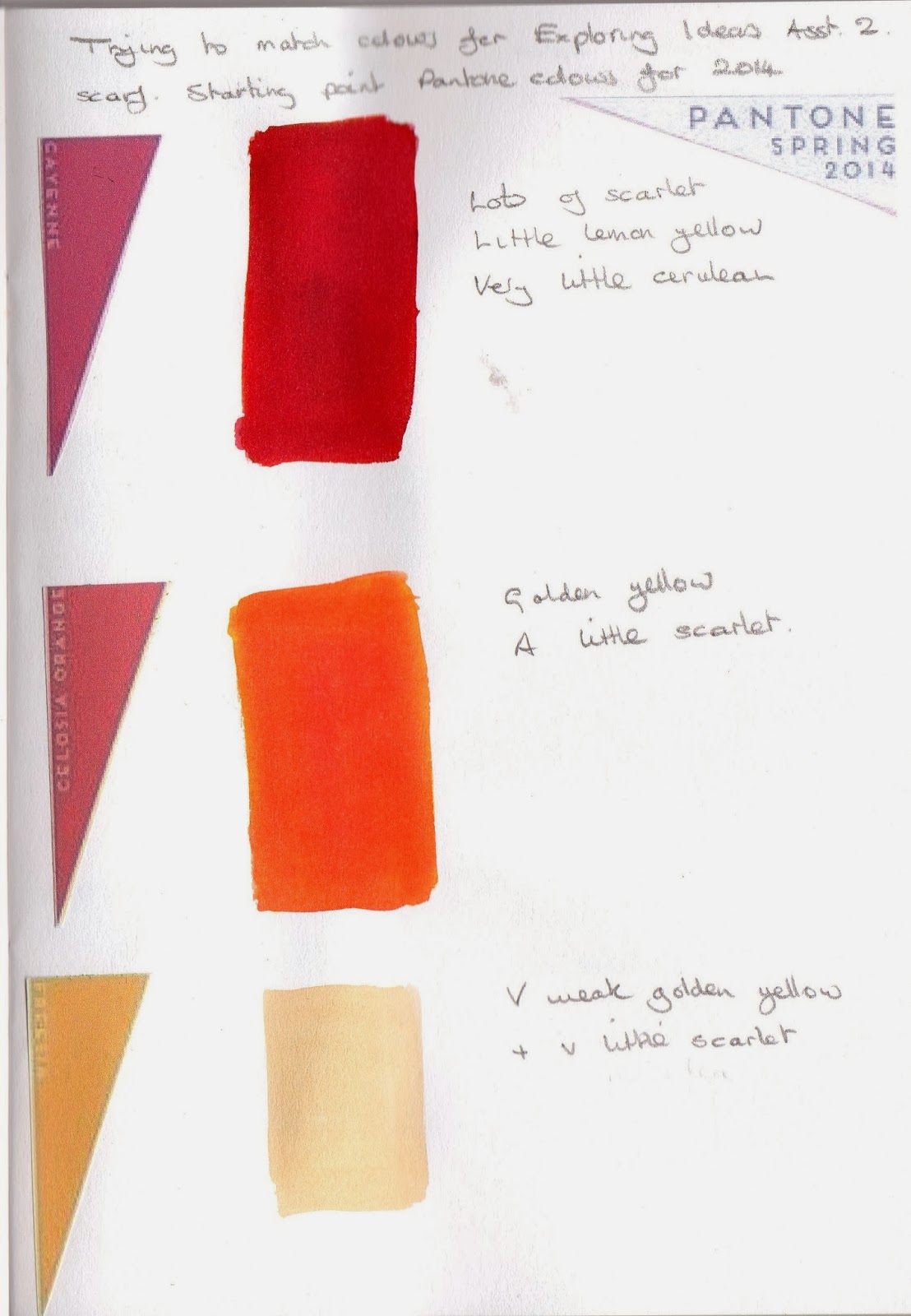
I'm going to select a palette from the 2014 colours I saw on the Pantone website and my first task will be to try to re-create them with my dyes.  For me the colours exude the warm and calm of a lovely Spring day.


I'm not sure how accurate my Pantone colours are considering the distorting effect of what I see on my screen and the limitations of printing.

I looked at the colours I mixed yesterday to see if I had anything approaching what I want.  What I found was that my colours are much more vibrant than those of Pantone.  The only ones than come anywhere near are the purples.  This is disappointing because I thought it might give me a toehold to build on.

So far, and I'm only 2 colours in, this is proving to be pretty difficult.  I seem to need a white to get some softness to the Freesia and to the Hemlock.  I'll see how it feels tomorrow.

This morning I contacted my tutor for some help then later on realised I could try that very technical solution - diluting my dyes.  Whilst my results are far from perfect they are at least in the right area.


There's just the density of the colours to think about now.

Working with the Pantone range of colours I've selected those that remind me of my garden in Spring.
The yellow of the daffodils (some with orange centres) blue scillas and purple crocuses are all in my palette.  Although Pantone offer a rather subtle range what I've chosen is from the brightest.  In reality my colours will be quite inaccurate for all the reasons I've alluded to previously.  However, if what I produce is attractive I'll be happy.


The palette for my scarf

Depending on the delicacy of the tone I can manage for the Hemlock base I'm hoping that the stronger colours won't be too heavily influenced by it.

I haven't any batiste to try out my dyes so I've stitched together a range of fabrics in a similar off white colour to my scarf.  There's a variety including muslin, linen, calico, silk and a twill.  I'm going to immersion dye them Hemlock which is my fairly neutral base and see what happens.   I expect to get a wide range of results.  If there's a colour similar to the one I'm aiming for I'll try out the other colours I need on it.


The outcome of my dyeing

The results were interesting.  There was nothing that came very close to where I was aiming but the best were the silk, muslin and linen. The muslin is about the closest fabric to the batiste. The crinkle cotton and the poplin must have some synthetic in there somewhere because they are barely coloured at all, the twill was quite blue and the linen fairly apple coloured.

Before I dyed my samples I put some of the dye in my dye book and it looked substantially darker on paper than it did on the fabric.  I'm going to try all my colours on paper just to see what happens. It seems a very inexact way to work that really requires much sampling before the event.


What should have been yellow looks far too orange and the whole thing look like it needs the lighter yellow so much.


I added some lighter yellow but now it is in danger of becoming too busy.

Tomorrow I'll try my colours on the muslin and linen, as well as discharge paste and bleach and see which works best.

I've found that the watery dye I need for the right colours spreads far too much on the fabric at the start of my brushstroke.  This happens on both the linen and the muslin.

Linen

Muslin

As the weave on my scarf is fairly open (although not as much as the muslin) this means I have to do some thinking about the consistency of my dye.  Currently I have small bottles with a quarter of a teaspoon of dye diluted in a fluid ounce of water and to get my pale colours I've diluted further.  This worked OK on paper.

I mixed more concentrated colours:

More concentrated colour

and whilst it was better the colours were far too dense and didn't go on smoothly.

I wondered if thickening the dye would work so I mixed some yellow with Manutex and tried it out. At first it was too thick and didn't brush out at all but gradually as I added water it became more manageable.  I think this might be the way to go.

Using thickened dye prior to ironing


and after heat setting
The colour is quite good here but there's still a lot of sampling to be done to get the right shape for the grasses and it may involve a little more dilution of the dye.

My original idea was to sample both bleach and discharge paste - those marks will be the first I make on my scarf.  I've tried discharge paste and it gives the result I'm after so I'm not going to pursue the bleach at all.  Bleach is much more unpredictable than discharge paste and I feel as though there's enough unpredictable around without adding to it.

Thickened dye and discharge paste

I have to give careful consideration to the brushstrokes I'll be using.  It's important that the stroke is spontaneous and has movement and vitality.  It's also important that the marks look in proportion to the size of the scarf.  To this end I put newspaper on my table to represent the size of the area of the larger panel.  I assembled a range of brushes I thought would make the right sort of marks and mixed some acrylic paint to the same consistency as my thickened dye. The outcome was yet another surprise

My brush selection
.

Marks made by the lower 5 bruhes
The marks made with the chunky brushes were just that - chunky with no possibility of any taper towards the end of the grasses.

Blue marks made with the top brush in the picture

The small brush at the top of my photo is the one I've been using throughout this work.  I thought the marks it made would be too fine for the scale of the scarf.  Instead it worked really well and I could get the sweeping stroke I needed with relative ease.

The Outcome
The scarf journey seems to have been a long one and I've learned a lot along the way.  Here's a reminder of what I was aiming for

Spring/summer colours
a light feel
plenty of movement from long sweeping brushstrokes


Did I get those things?  Yes I think I did but there are some things I changed along the way and some I wish I could change now.

First I dyed my scarf a colour based on the Pantone Hemlock.  It dyed well - no patches.  I used discharge paste to make my first images on the scarf but the delicacy of the Hemlock meant that it was hardly worth the bother.

I mixed enough thickened dye for both ends of the scarf.  The impact of Manutex on the dyes was something I'd overlooked.  Working on the principle that you can always add a bit more but can't take it out, it took me a long time to get a depth of colour I was happy with.  At this point my adherence to Pantonne became even more tenuous.

Beefing up my colours

My intention was to print at the ends of the scarf; from one end 85cm in and from the other end 70cm.  I decided to try the shorter length first to get my eye in.  I'd had dummy runs on paper to get the movement right but when it came to fabric it was very different.  Even though I was doing the shorter length I was unable to get the free grass feel I was after.  In order to have my dye reach the top of the grass I loaded my brush heavily and got too much on initial impact with the fabric.

Lots of dye as my brush touched down

In my anxiety to get some dye to the top of my design I put in too many strokes and ended up with something I consider looks far too busy.

I decided to make the design on the opposite end of the scarf considerably shorter to try to get over the problems I'd encountered.  It worked much better.

Shorter brushstrokes - less dye - less blobby
Because there was less dye on the brush the colour seemed less intense and the whole feel was less frantic.

I rinsed the scarf and soaked it in Colsperse and although no colour ran the colours looked more subdued at the end of the process.

I think the most important lesson is that you should always do tests on the fabric you're planning to use.

As a learning experience this has been a good one but I'm afraid my scarf will be a very limited edition!

Wednesday, 1 January 2014

Colour trends for Spring/Summer 2014

Although I'm nowhere near ready to make my design selection I thought it might be a good idea to look at colour trends so that when I come to decision making I can factor it in. It will also link in nicely  with the mixing of dye colours I intend to do.

Pantone are an American based company well known for the Pantone Matching System which standardises colours enabling accurate matching across a wide range of industries including fashion. Each year after much debate Pantone declare a "Colour of the Year" and link it to contemporary events, like recession.  Nominating "Honeysuckle" as colour of the year in 2011 the press release said 

In times of stress we need something to lift our spirits.  Honeysuckle is a captivating, stimulating colur that gets the adrenalin going, perfect to ward off the blues.
Honeysuckle
 http://en.wikipedia.org/wiki/Pantone

For many years Pantone has closely examined the colours at New York Fashion Week and similar events and distilled the findings into a few key trends.

Leatrice Eismann, Executive Director of the Pantone Colour Institute, says that the greys and neutrals prevalent this season make a good bridge between the soft pastels and more vibrant colours.  She maintains that Placid Blue and Hemlock can be used as neutrals.  There are some interesting thoughts on the video on the link below.  It's well worth a look.

http://www.pantone.com/pages/FCR/default.aspx?season=spring&year=2014&pid=3


http://www.fashionising.com/trends/b--spring-colors-2014-65123.html is a website that displays the new colours beautifully, although it acknowledges it's debt to Pantone.  
Forecasting agency Lenzing predicts colours for Spring 2014 will take shape round 5 themes: sensual, serene, colourquake, oasis and diaphanous.

This is how the colours are presented:

Serene

Colourquake

Diaphanous

Sensual

Oasis

These palettes are all lovely.

Spinexpo is another forecasting agency quoted by Fashionising.com.  Spinexpo predicts a slightly different scenario based on tonal families.


These are very similar colours to the previous ones, just grouped differently.  It's very noticeable that there are no primary colours. This will be a challenge with my Procion dyes!